Event Studio - A bilingual event agency website with 150+ attractions
A bilingual event agency website with a video hero and 17 service pages. Visitors can search more than 150 attractions, and a map of Poland highlights the region each phone number covers.
Visit website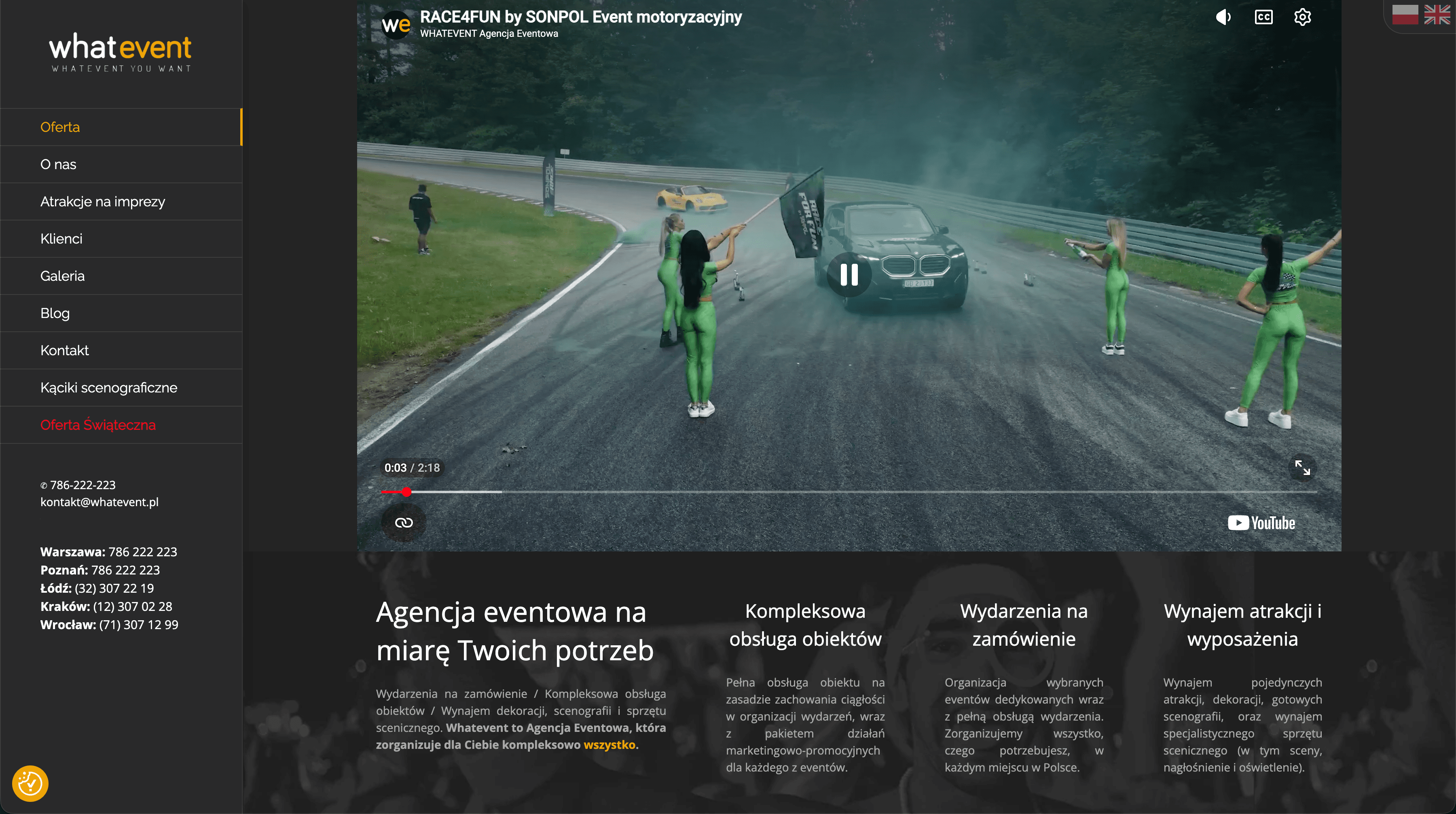
How we organised an event agency's offer: 17 services and 150+ attractions in two languages
The event agency had enough on offer for several companies, but its old WordPress site couldn't show it. Attractions, services, catalogues and the blog lived separately, and the English version was incomplete. We designed a bilingual event agency website that brings the whole offer together in one consistent place, lets visitors search more than 150 attractions and shows straight away which branch to call.
The challenge
Someone looking for attractions for a company picnic had to dig through several sections to find what they wanted. The English version covered only part of the offer. With so many services and attractions, the site needed a layout that doesn't overwhelm and navigation that always shows where you are.
Design: a stage after dark
Colours and typography
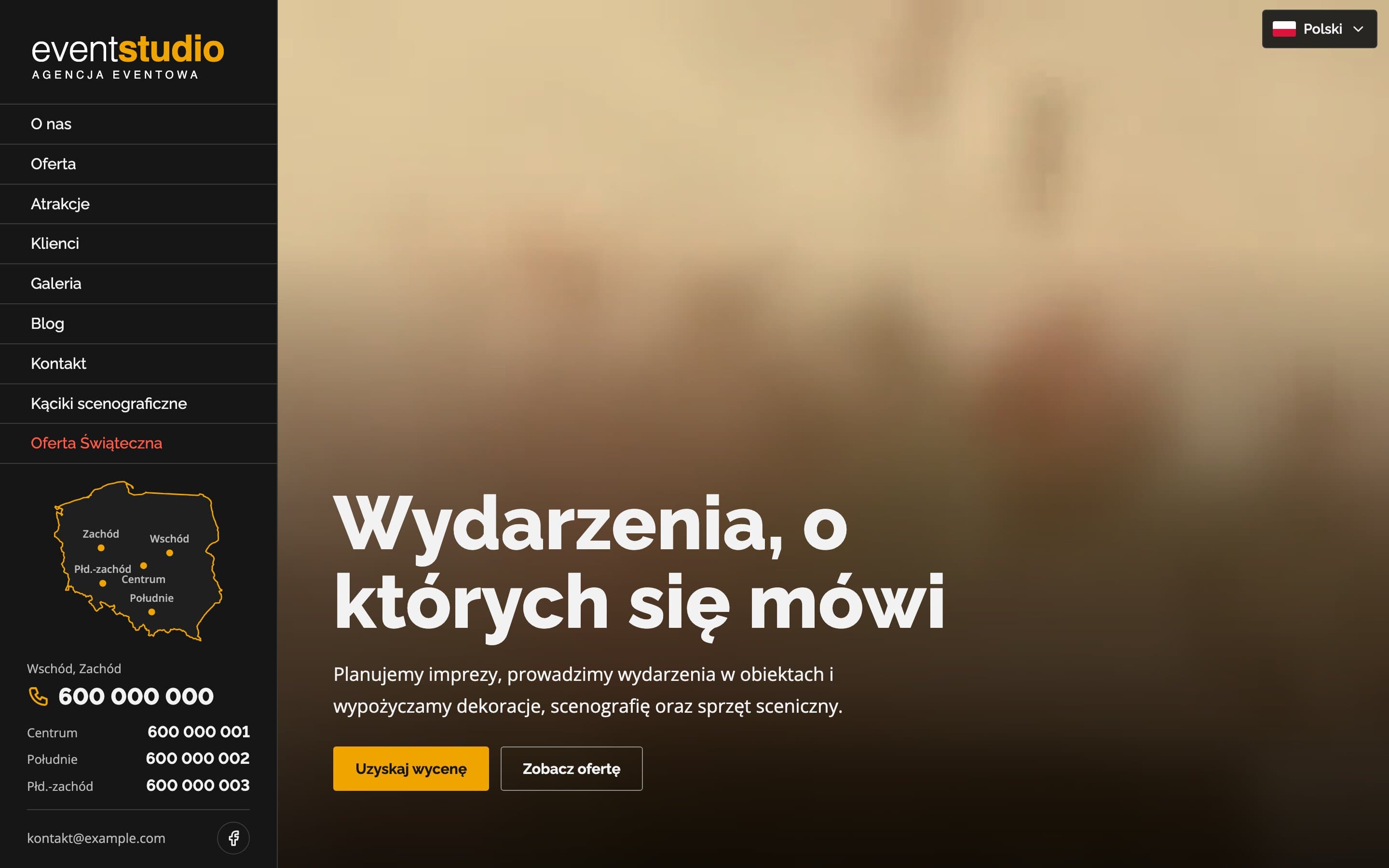
The site has a dark graphite background, like a stage before the lights come up, and the only accent is an amber orange. It appears on buttons, the active menu item, prices and underlines. Headings are set in Raleway, elegant and slightly airy, and body text in Open Sans, which stays readable even in long service descriptions.
A sidebar layout
On desktop, the left column is fixed: logo, menu, a map of branches and phone numbers. The content scrolls next to it at full screen height. The menu highlights the section you're currently viewing, so on a long homepage you always know where you are. On phones, the sidebar becomes a menu whose items slide in one by one when it opens.
A video hero
The first screen is a looping video from past events, which shows their scale better than any photo. Phones get a separate, vertical and lighter version of the video, with a still frame shown until it loads.
Offer tiles
Services and attractions are compact tiles with a photo and the title on the image. On hover, a short description slides in, an orange line draws in from the left and the photo zooms in slightly. This fits a lot of the offer on one screen, while details appear only when someone shows interest.
Features that help people find the right thing
- A map of Poland with branches. The country outline is drawn from real cartographic data, and hovering over a phone number highlights the region it covers, so clients know who to call.
- A catalogue of more than 150 attractions with search and a "from" price for each item.
- 17 service pages in three groups (event organisation, stages and outdoor events, rentals), each with a gallery and a list of what the service includes.
- Themed catalogues (scenic photo corners, puzzle boxes, a Christmas offer) with a page viewer: arrows, keyboard support, a counter and the next page preloaded.
- A gallery of past events in the same viewer, with thumbnails.
SEO: two languages, one consistent structure
- Full Polish and English versions linked with hreflang tags, so Google shows the right version depending on the user's language.
- Every service as its own page with its own title and description aimed at searches such as "corporate event organisation" or "stage rental", plus service structured data.
- A blog with guides for event planners, marked up as blog posts, answering the questions people google before planning an event.
- Optimised images and video, so the large site still loads quickly.
The result
A big offer that no longer overwhelms. In a few clicks, clients find a service or an attraction, check the price and know which branch to call, in Polish or in English. The agency gets a site that looks like its events: ambitious, but under control.
Want a similar project?
Tell us about your business and we'll suggest where to start.
More projects
Therapy & Growth Practice - A calm website for a therapist
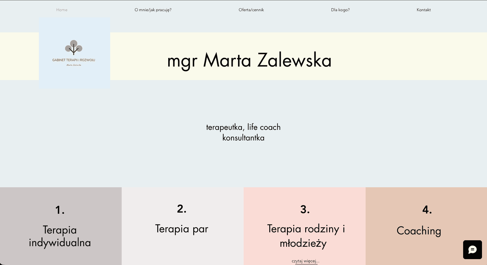
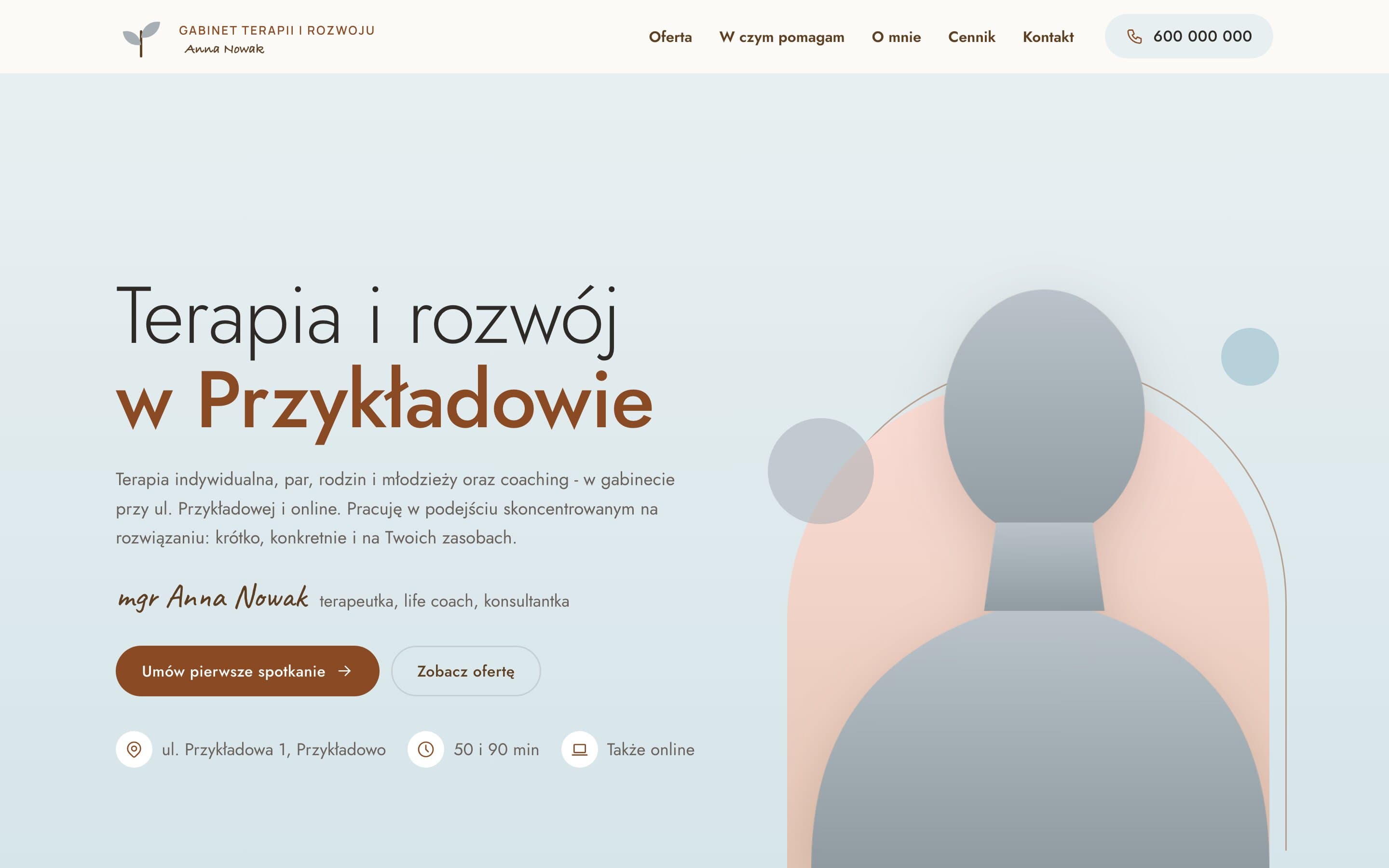
A therapy practice moved from Wix to a fast, warm website. A portrait on a pastel arch, separate pages for each form of therapy with price and session length, and a simple path to the first appointment.
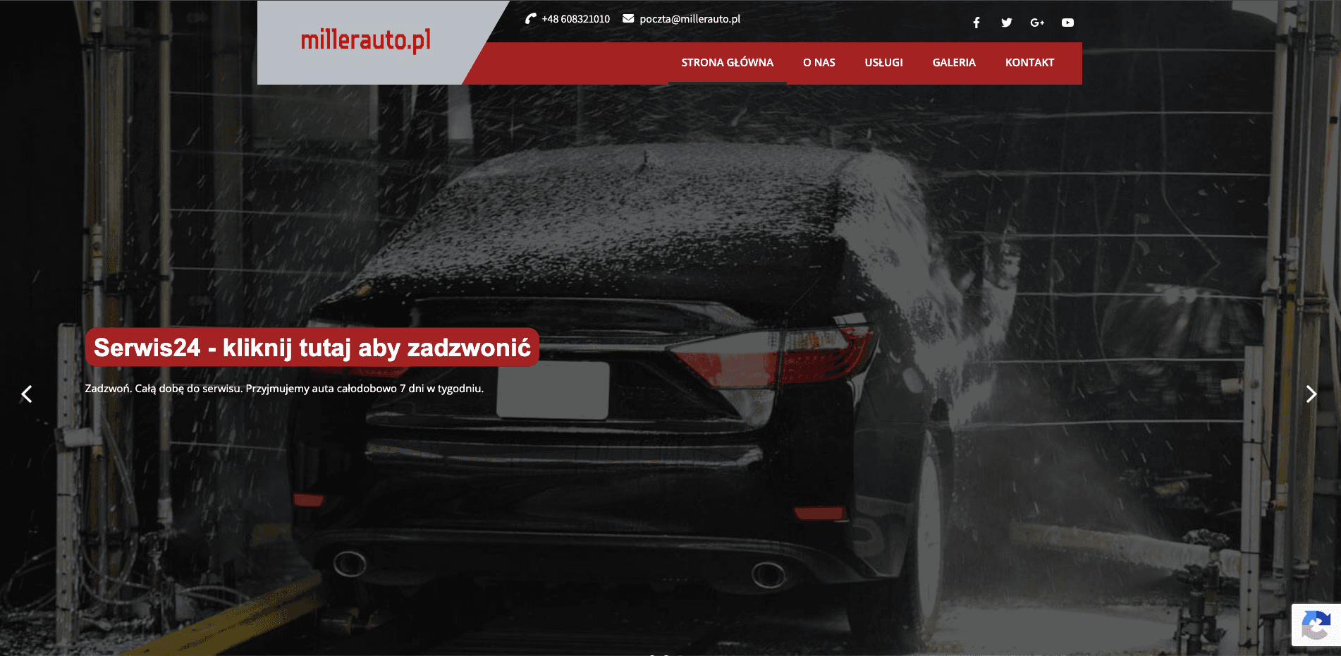
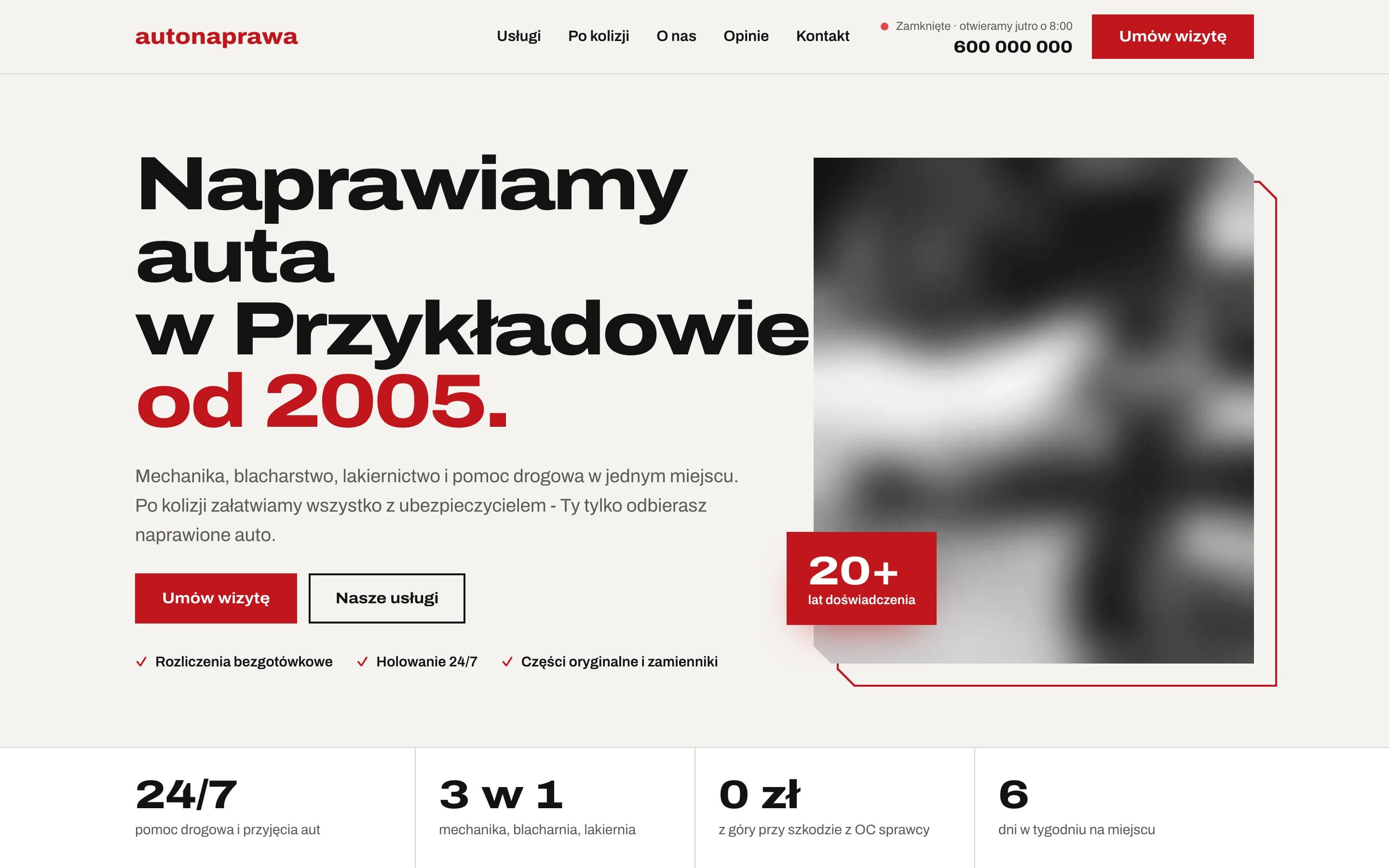
AutoNaprawa - A garage and body shop website built around collision repairs
A garage website rebuilt from scratch, replacing an old WordPress site. Drivers who just had a collision get a dedicated step-by-step path, visits are booked online, and the header shows a live opening status. Plus 8 service pages built for local SEO.
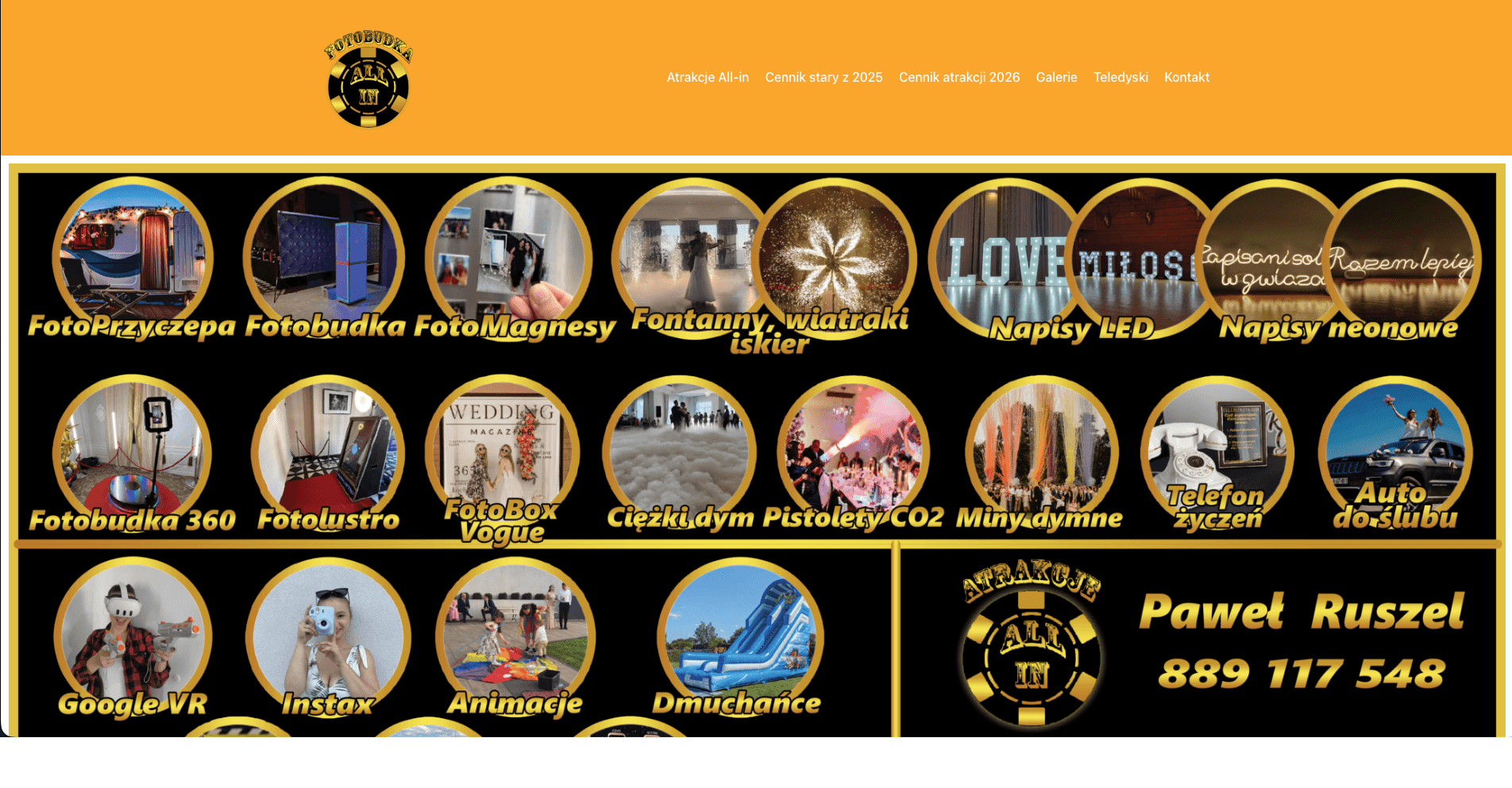
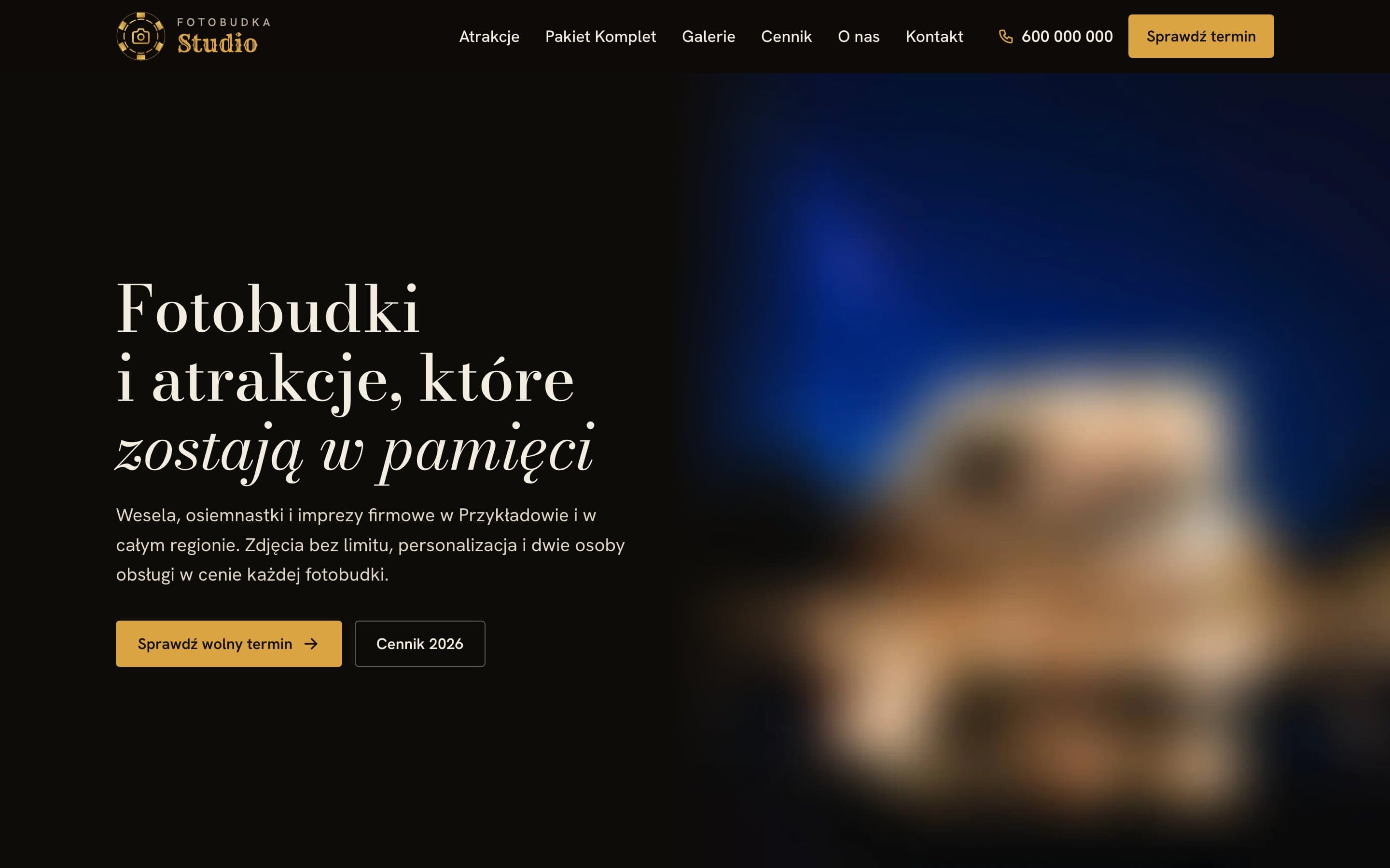
Fotobudka Studio - An elegant website for a wedding photo booth rental
An elegant website for a photo booth rental: a catalogue of attractions with prices, a clearly presented package and a price list split into categories. Event galleries have filters and an easy-to-use photo viewer.