Therapy & Growth Practice - A calm website for a therapist
A therapy practice moved from Wix to a fast, warm website. A portrait on a pastel arch, separate pages for each form of therapy with price and session length, and a simple path to the first appointment.
Visit website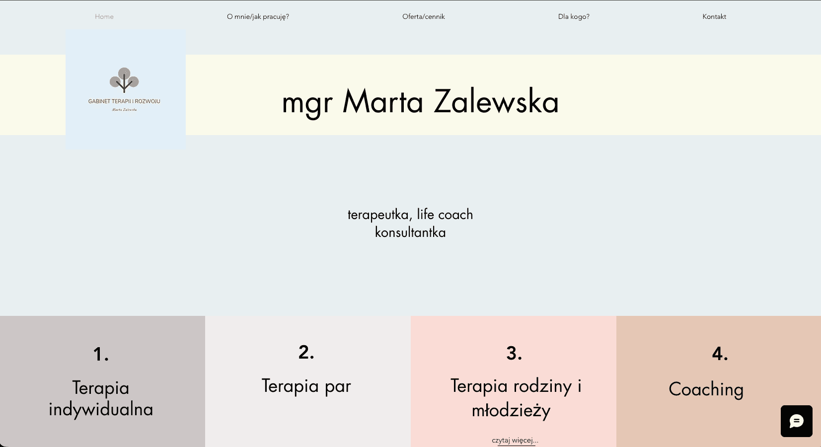
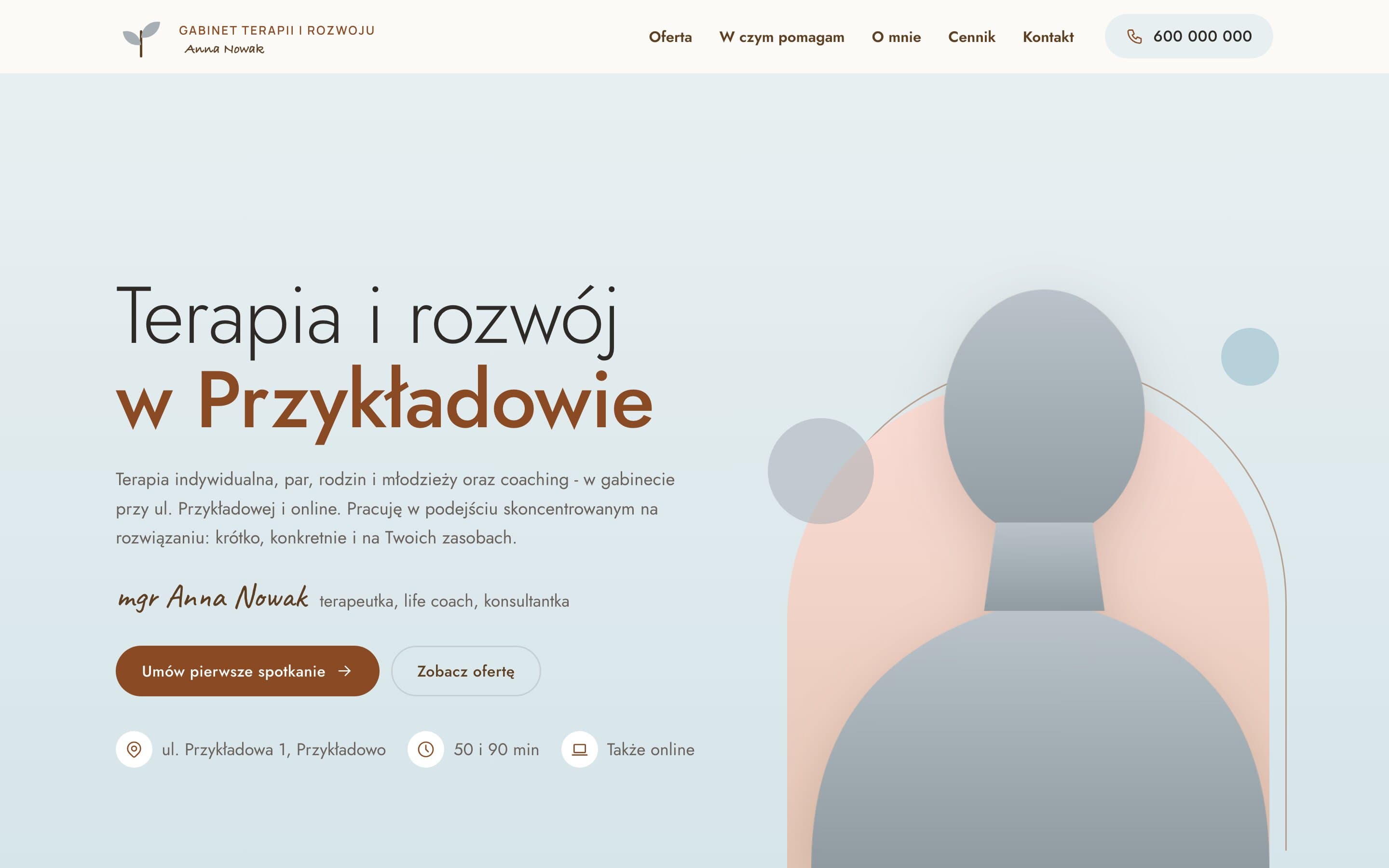
How we built a therapy practice website that calms rather than overwhelms
People looking for a therapist often do it at a difficult time, and they need to trust someone before they call. The old Wix site loaded slowly, and the offer had to be pieced together from several pages. We designed a therapist website that shows who you'll be meeting from the first screen, and states clearly for every form of therapy how long a session lasts, what it costs and whether you can meet online.
The challenge
The Wix site loaded slowly, and information about the forms of therapy, prices and online sessions was spread across several places. For someone already hesitant to make the first call, that's one more barrier. At the same time, the practice had a recognisable style, a tree logo and pastel service tiles, which we wanted to keep and refine.
Design: warmth, calm and the therapist's face
A hero with a portrait on an arch
The first screen is built around a person, not a stock photo. The portrait is cut out from its background and stands on a pastel arch with a rounded top, with the head rising above its edge. It's a small detail that makes the person feel closer and more present. Behind the arch, an offset outline of the same shape adds a light, hand-drawn touch, and a few small circles round off the composition.
Palette
The colours are soft and muted: mist, powder pink, peach, butter, sand. Each form of therapy has its own pastel tile, just like on the practice's previous site, so returning clients feel at home right away. The brown from the logo is the only strong colour and is used sparingly: on buttons, links and small icons, never on large areas.
Typography
Headings and body text are set in Jost, a geometric but gentle sans serif. Personal touches, the therapist's name under the portrait and the signature on the "About me" page, use the handwritten Caveat typeface, which gives the site a warm, human tone.
Details
Two leaves from the logo mark return as a subtle background for subpage headers. The steps of working together, from the first call to the first change, appear one by one when the section scrolls into view. Icons instead of numbers guide the eye without a school-like "Step 1 of 4".
Features that lower the barrier to first contact
- A separate page for each form of therapy: individual, couples, family and teens, coaching and online sessions. Every page has the same information in the same place: who it's for, how long it takes, how much it costs and where it happens.
- A price list with packages that shows the saving for longer-term work at a glance.
- A contact section with phone booking hours, the practice address, a directions map and a form where you choose the type of session.
- An "About me" page that explains the approach in plain language.
SEO: every form of therapy targets its own search
- Separate pages with their own titles and descriptions for searches such as "couples therapy", "family therapy" or "online therapy".
- Structured data describing the therapist who runs the practice, a catalogue of services with prices, and breadcrumbs.
- A custom sitemap and fully static code with almost no JavaScript, so the site opens quickly even on a weak connection.
The result
Instead of piecing information together from several pages, someone looking for help finds out in one place who they'll meet, what it costs and how to book. And the site does what a good practice does: it puts people at ease.
Want a similar project?
Tell us about your business and we'll suggest where to start.
More projects
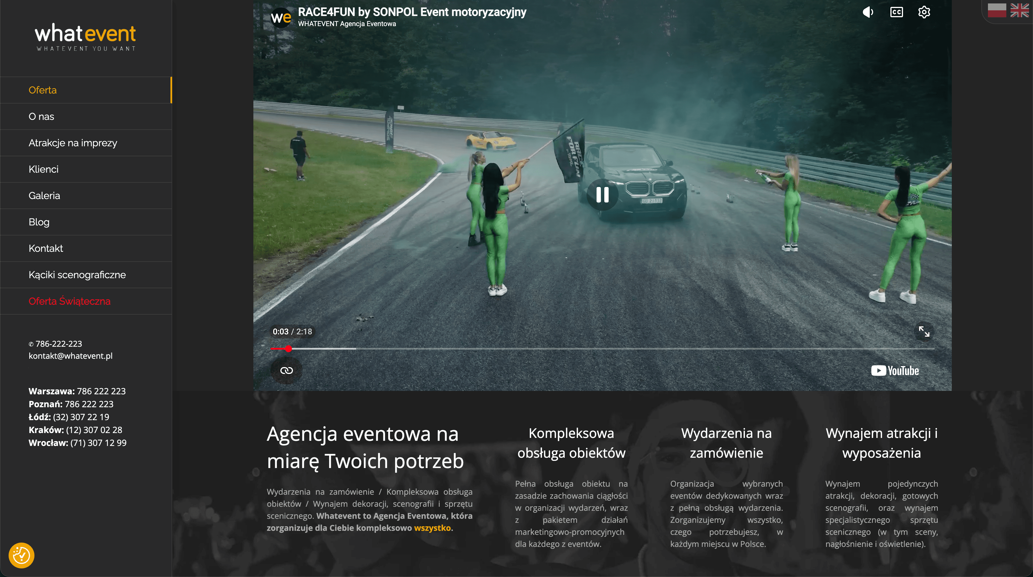
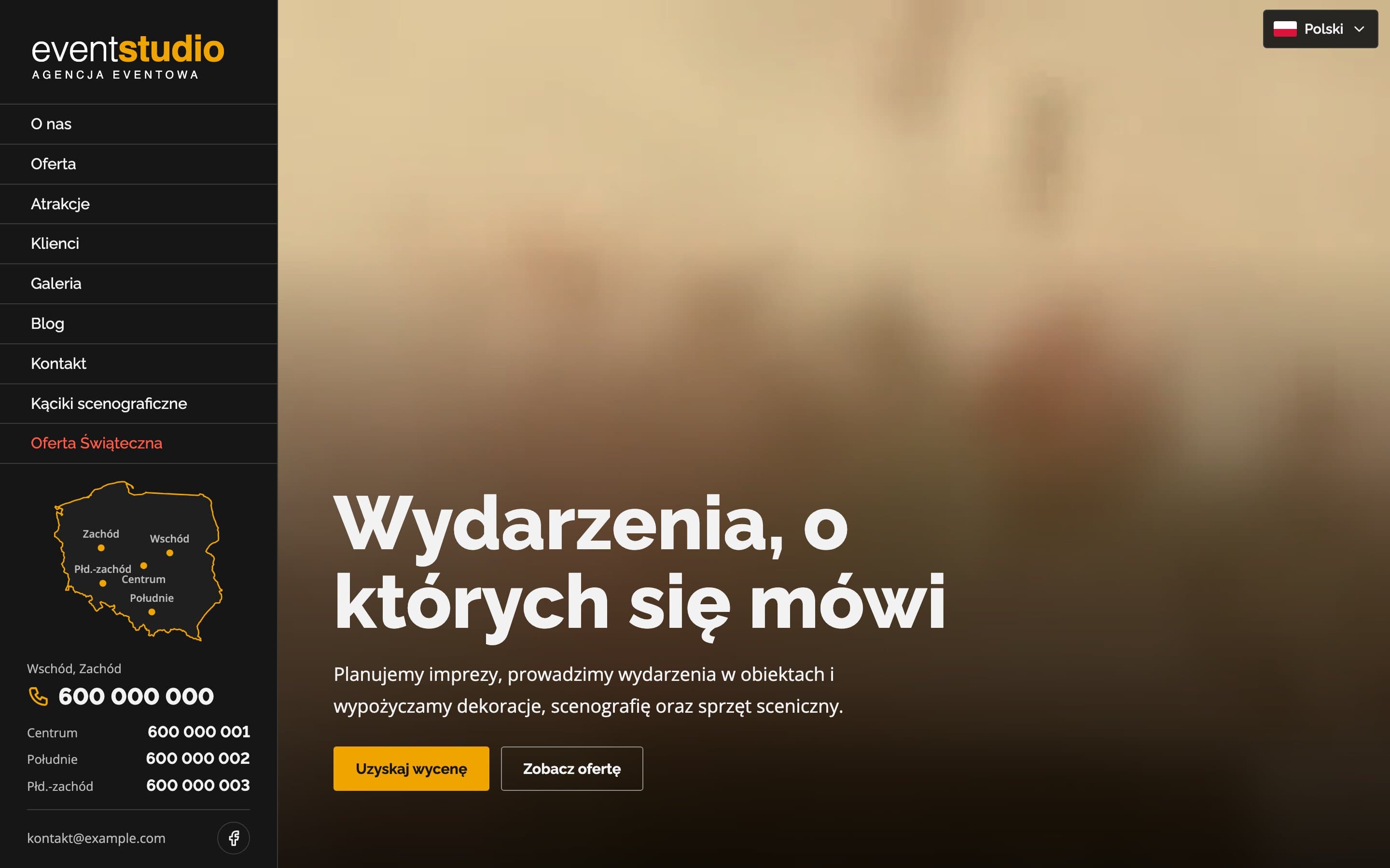
Event Studio - A bilingual event agency website with 150+ attractions
A bilingual event agency website with a video hero and 17 service pages. Visitors can search more than 150 attractions, and a map of Poland highlights the region each phone number covers.
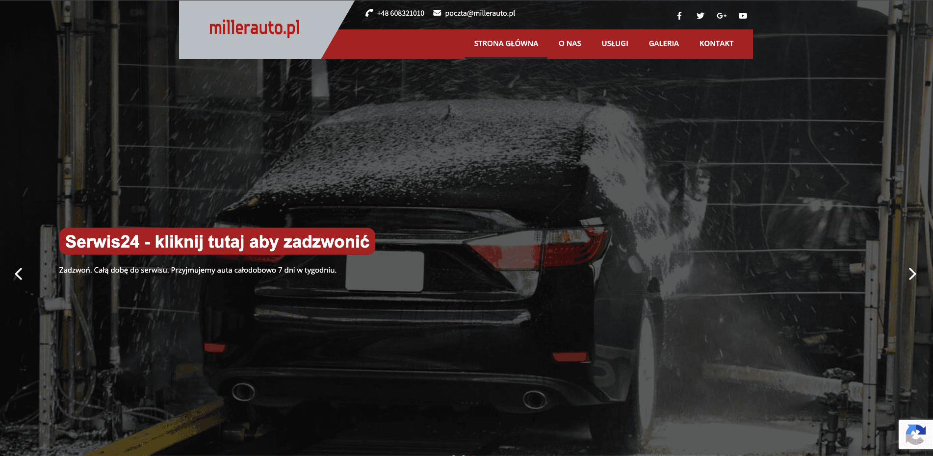
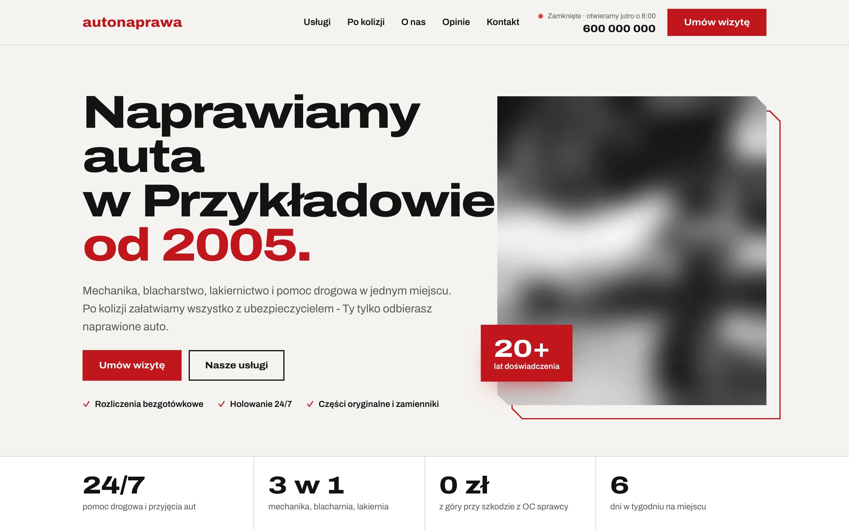
AutoNaprawa - A garage and body shop website built around collision repairs
A garage website rebuilt from scratch, replacing an old WordPress site. Drivers who just had a collision get a dedicated step-by-step path, visits are booked online, and the header shows a live opening status. Plus 8 service pages built for local SEO.
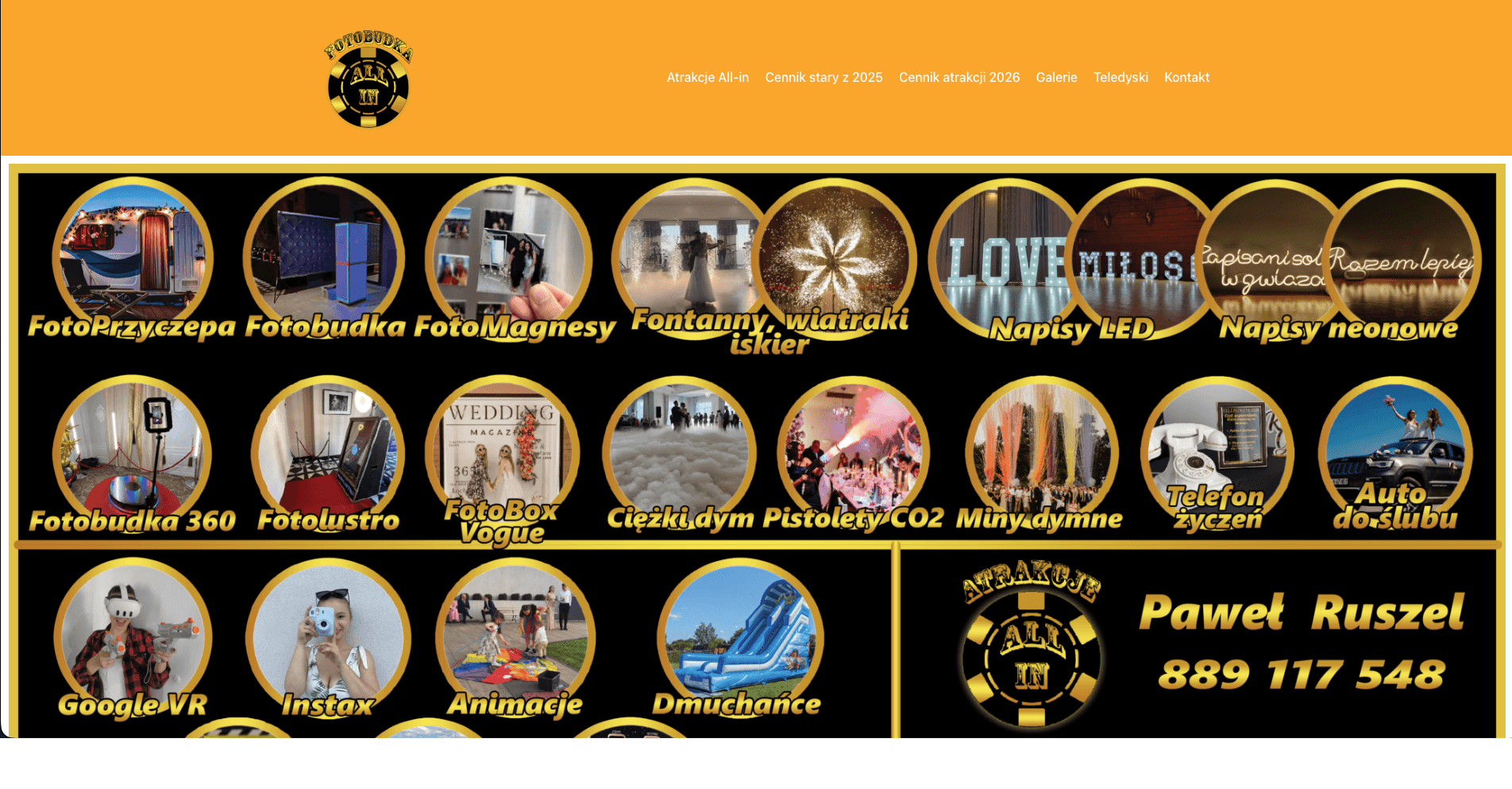
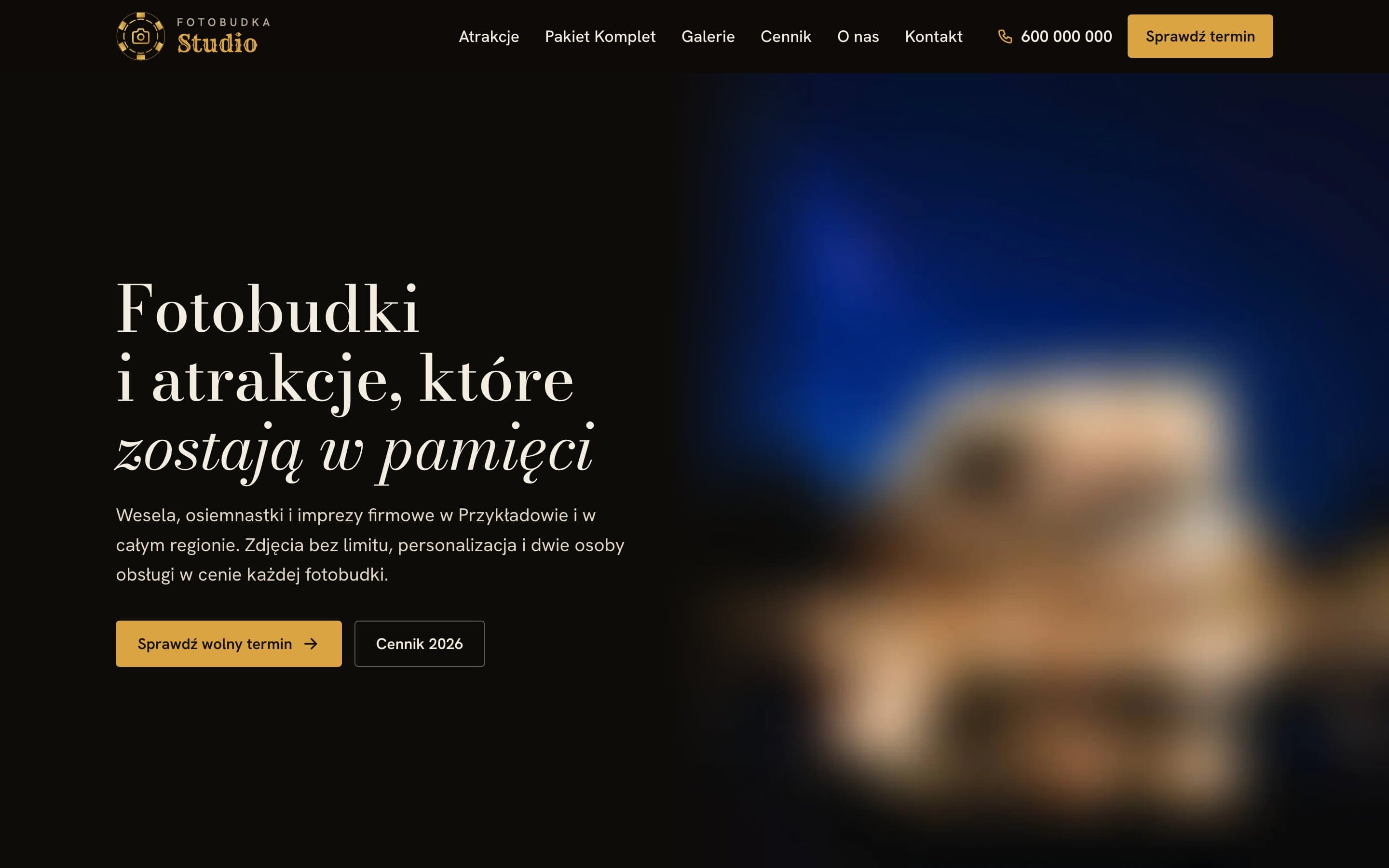
Fotobudka Studio - An elegant website for a wedding photo booth rental
An elegant website for a photo booth rental: a catalogue of attractions with prices, a clearly presented package and a price list split into categories. Event galleries have filters and an easy-to-use photo viewer.