Fotobudka Studio - An elegant website for a wedding photo booth rental
An elegant website for a photo booth rental: a catalogue of attractions with prices, a clearly presented package and a price list split into categories. Event galleries have filters and an easy-to-use photo viewer.
Visit website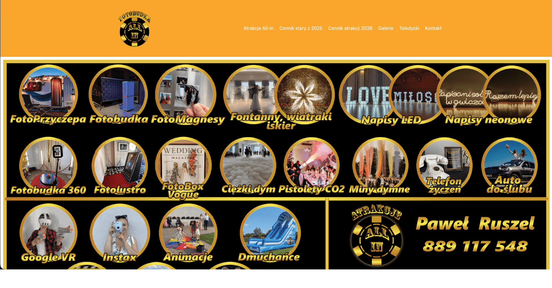
How we brought a photo booth company's offer, prices and galleries together in one elegant, wedding-night website
Couples choose wedding attractions in the evenings, in between booking the venue, the band and the photographer. They want to see quickly what's on offer, what's included and what it costs. This rental's offer was split between a WordPress site and a separate price list in Canva, and the galleries were one long list. We designed a website for a wedding photo booth rental that brings the offer, prices and past events together in one place, and looks like an elegant evening rather than a catalogue.
The challenge
To compare a photo booth with a magic mirror, you had to jump between the site and a price list in Canva. The wedding galleries had no filters, so finding an event similar to yours meant a lot of scrolling. The offer was broad, from a 360 booth to heavy smoke and LOVE letters, but nothing organised it.
Design: the mood of a wedding night
Colours
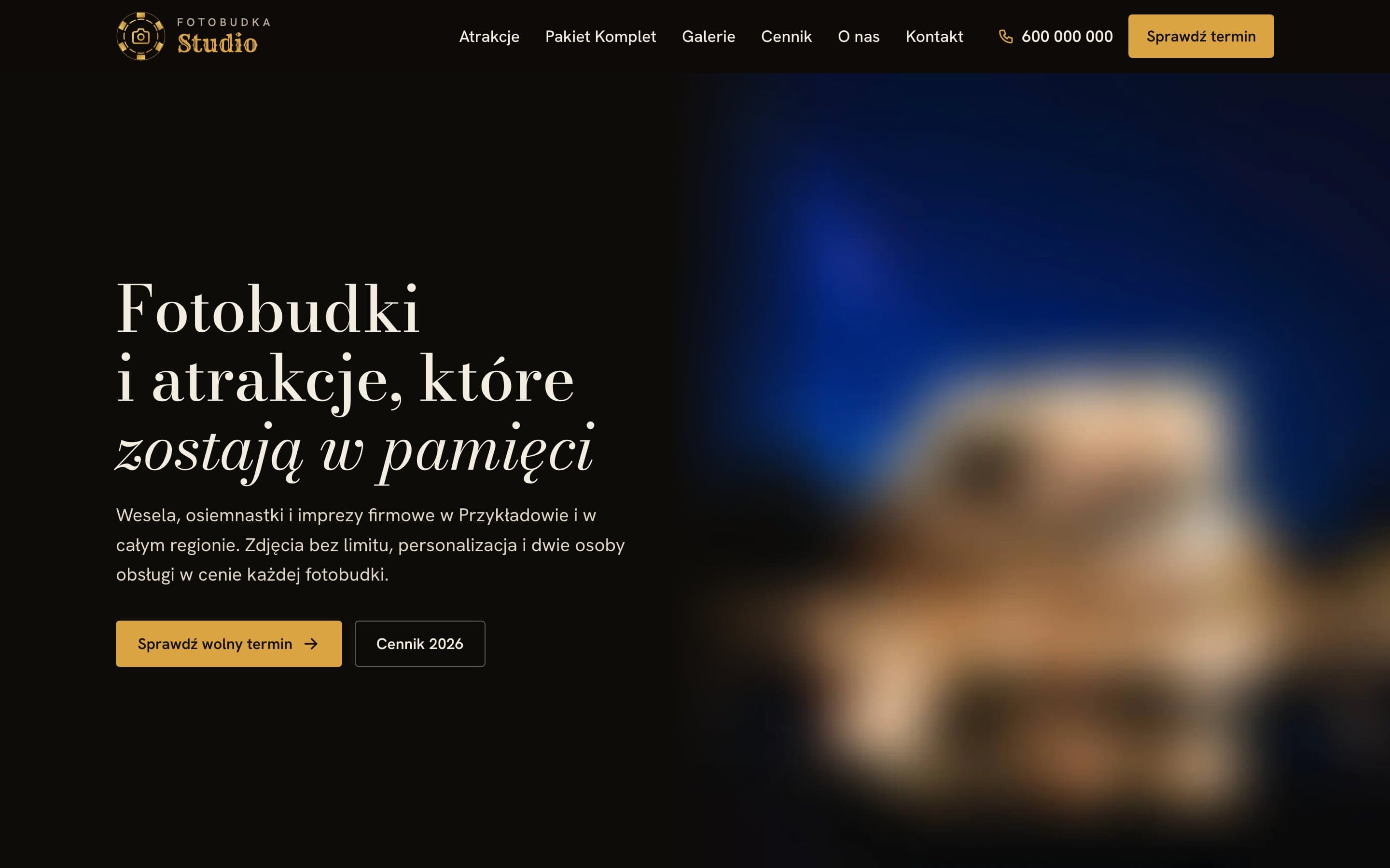
Most of the site sits on a dark, almost black background, like a venue after the lights go down, and gold is the only accent: buttons, prices, highlights. On light sections the gold darkens to a shade that keeps enough contrast with the background, so prices stay readable on cream paper too. We deliberately left out gradient text, glowing shadows under buttons and floating cards. The accent is flat and the corners only slightly rounded, so the site feels elegant rather than loud.
Typography
Headings are set in Bodoni Moda, a classic serif known from fashion magazine covers. Words that need extra weight are set in italics rather than a different colour. Body text uses Hanken Grotesk, a neutral, readable sans serif that doesn't compete with the headings.
Logo
The mark is a gold chip with a camera icon in the middle, and the logo is the only place with a gradient. It works in the header, in the footer and as a favicon.
Hero and numbers
The first screen is a full-height night photo of an attraction with a short line that uses italics. Right below it is a numbers section that counts up from zero once, the first time it comes into view: events done, reviews, likes and the number of attractions on offer.
Features that help couples decide
- An attractions catalogue: photo booths, a magic mirror, a 360 booth, a photo trailer, heavy smoke, sparklers, LOVE letters and more. Each item has a photo, a short description and a "from" price.
- The included package, shown once and clearly: unlimited photos, personalisation and on-site staff, with examples of printed photo strips.
- A price list split into categories, with a table of prices per number of hours and links straight to each attraction.
- Galleries with filters (weddings, birthdays, proms, corporate) and a photo viewer with arrows, keyboard support, a counter and the next photo preloaded in the background.
- A "Check a free date" form with a choice of event type and a field for details such as the venue, attraction and number of hours.
SEO: an offer Google understands
- Structured data for an entertainment business with an offer catalogue, covering attractions with prices and the service area.
- Separate price list and gallery pages with their own titles and descriptions aimed at searches such as "wedding photo booth" or "magic mirror price".
- Breadcrumbs and descriptive alt text for photos.
- Automatically optimised images, so even large galleries load quickly.
The result
Couples compare attractions, check prices and browse similar events in one place, then ask about a free date with a single button. The site itself feels like the promise of a great party, just in an elegant edition.
Want a similar project?
Tell us about your business and we'll suggest where to start.
More projects
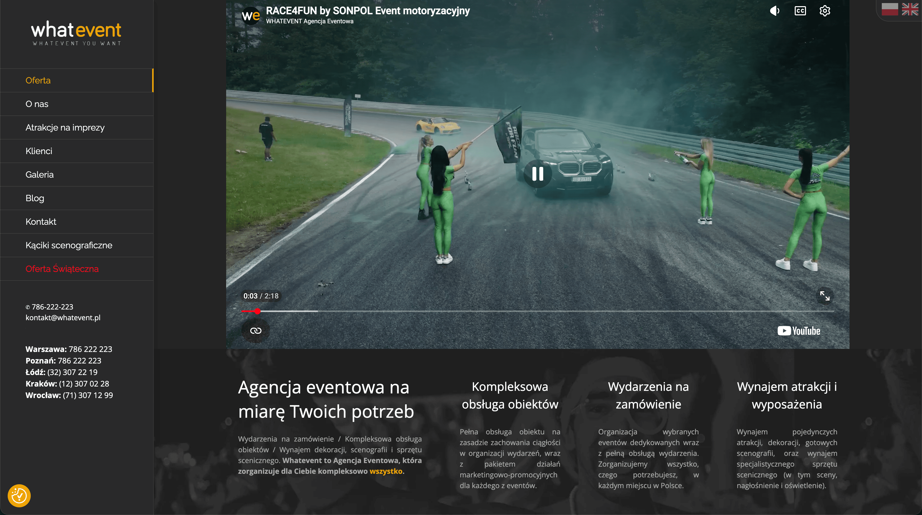
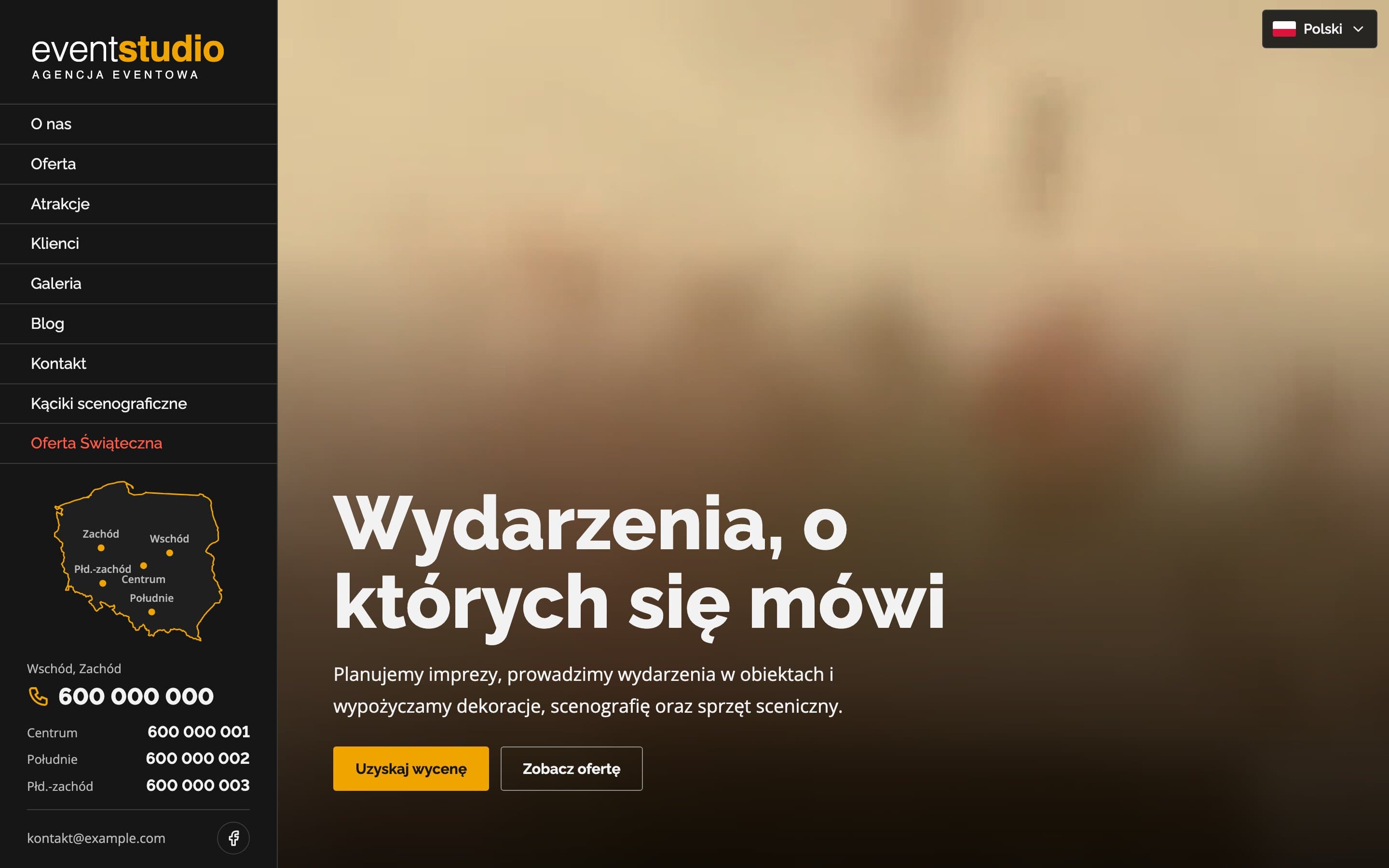
Event Studio - A bilingual event agency website with 150+ attractions
A bilingual event agency website with a video hero and 17 service pages. Visitors can search more than 150 attractions, and a map of Poland highlights the region each phone number covers.
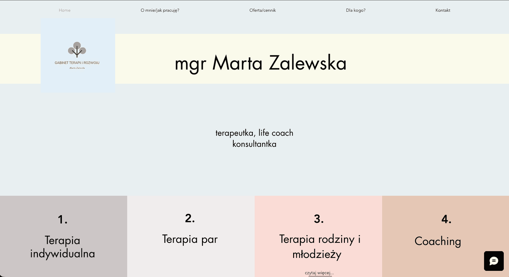
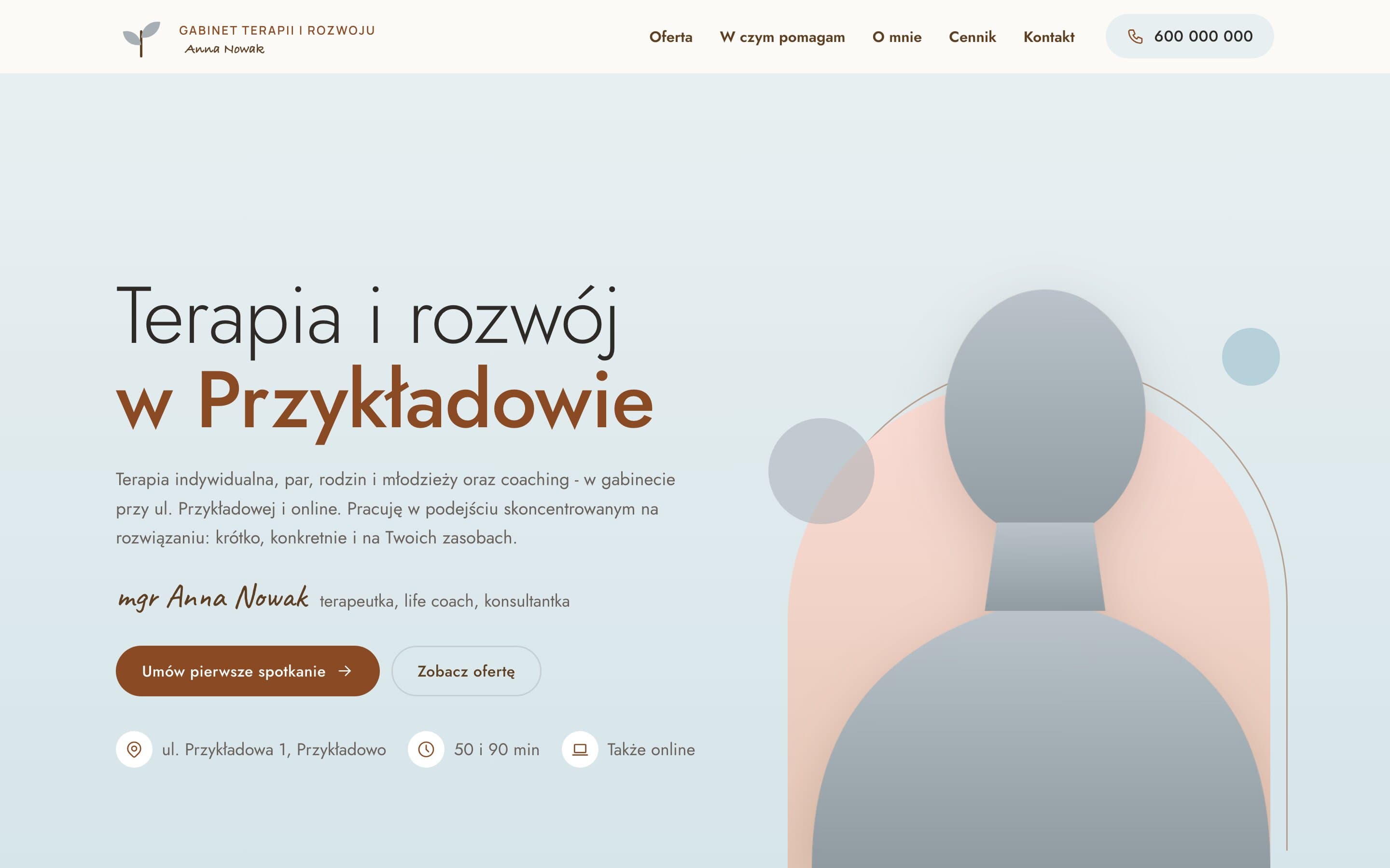
Therapy & Growth Practice - A calm website for a therapist
A therapy practice moved from Wix to a fast, warm website. A portrait on a pastel arch, separate pages for each form of therapy with price and session length, and a simple path to the first appointment.
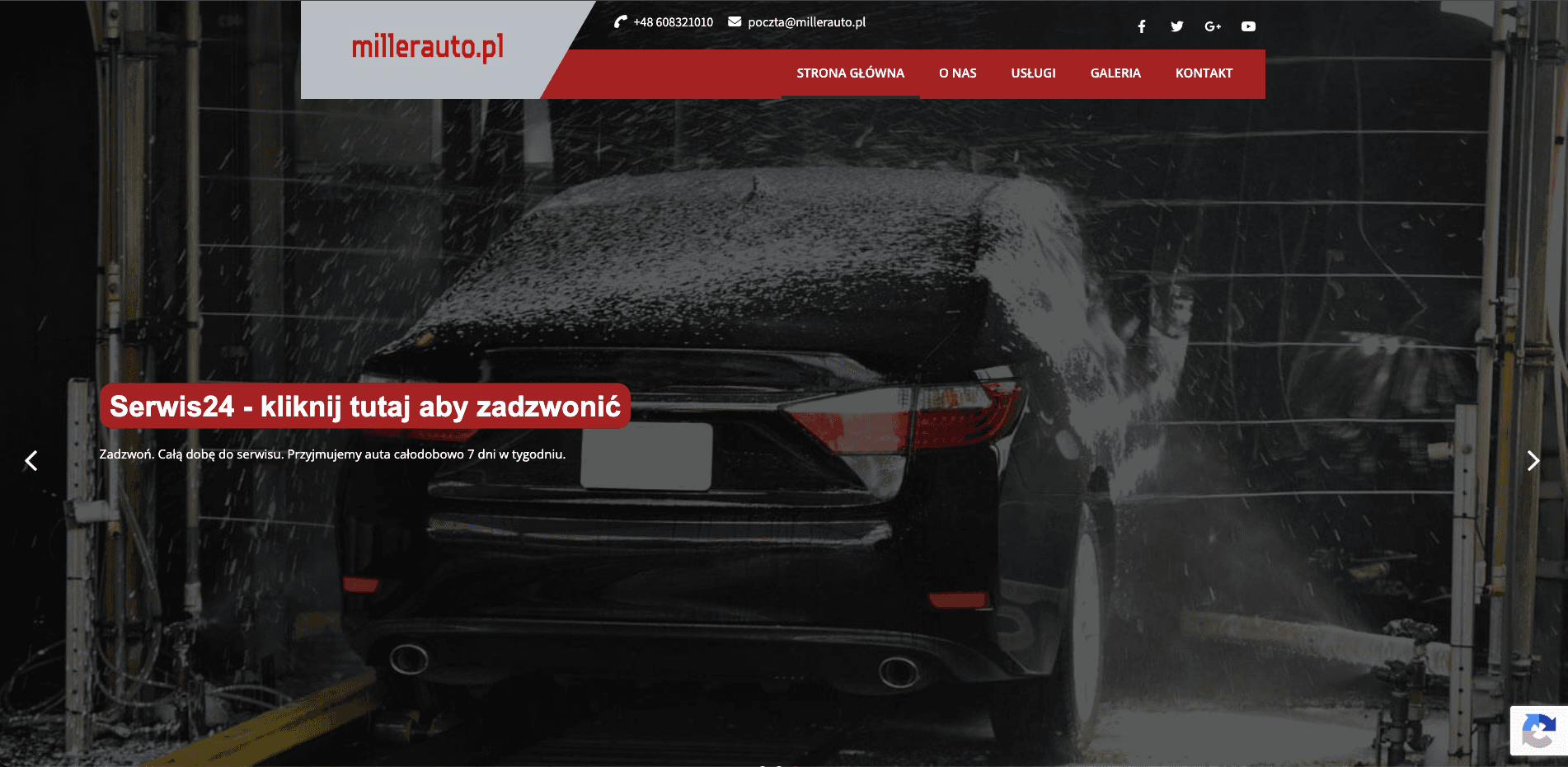
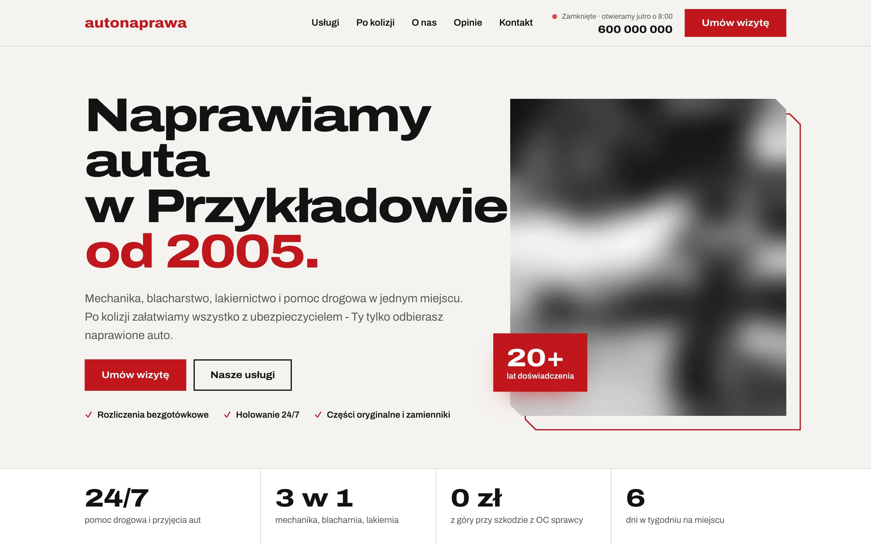
AutoNaprawa - A garage and body shop website built around collision repairs
A garage website rebuilt from scratch, replacing an old WordPress site. Drivers who just had a collision get a dedicated step-by-step path, visits are booked online, and the header shows a live opening status. Plus 8 service pages built for local SEO.