AutoNaprawa - A garage and body shop website built around collision repairs
A garage website rebuilt from scratch, replacing an old WordPress site. Drivers who just had a collision get a dedicated step-by-step path, visits are booked online, and the header shows a live opening status. Plus 8 service pages built for local SEO.
Visit website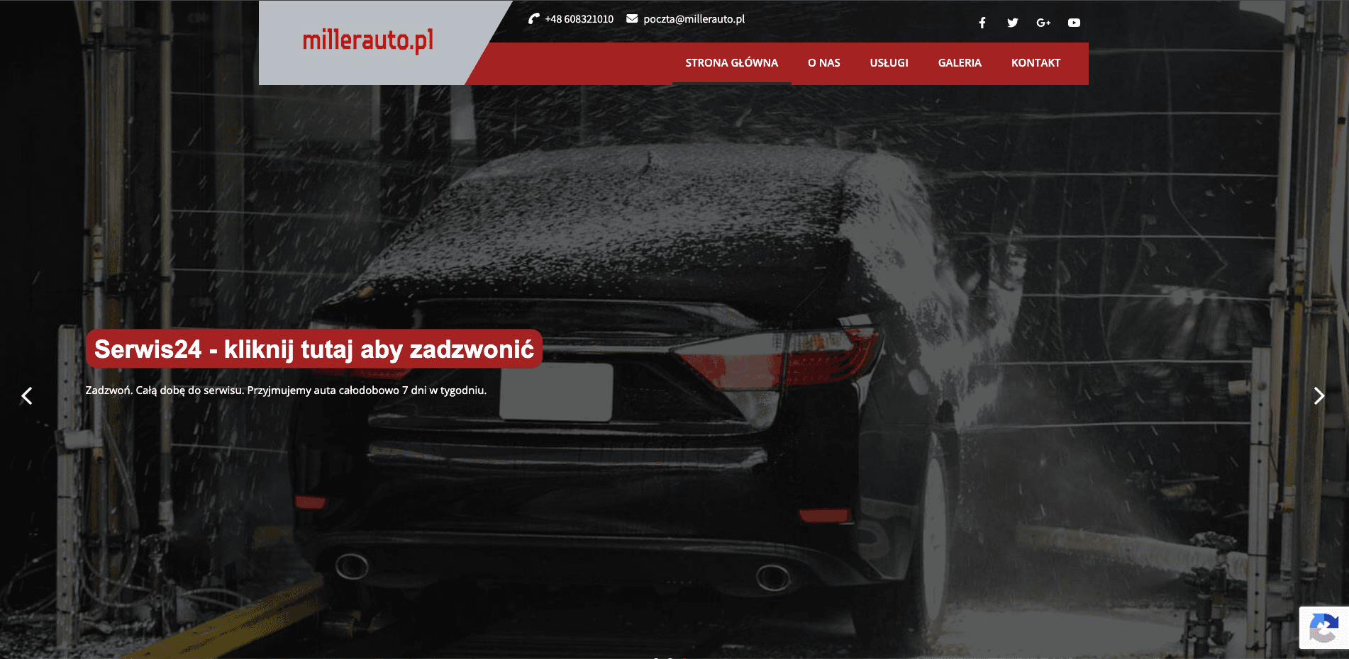
How we showed drivers after a collision that one phone call is all it takes
Right after a collision, a driver is stressed and doesn't know where to start. A garage that deals with the insurer for them has exactly what they need, but the old WordPress site hid that offer among near-identical pages. We designed a website for a garage and body shop that puts accident repairs front and centre, organises 8 services for local search and lets customers book a visit online.
The challenge
The old site had many similar pages and contact details scattered across them. The most important service, accident repair settled directly with the insurer, got lost in the crowd, and the site never said plainly what to do after a crash. Opening hours were hard to find, and booking a visit meant calling.
Design: a family garage with character
Colours and typography
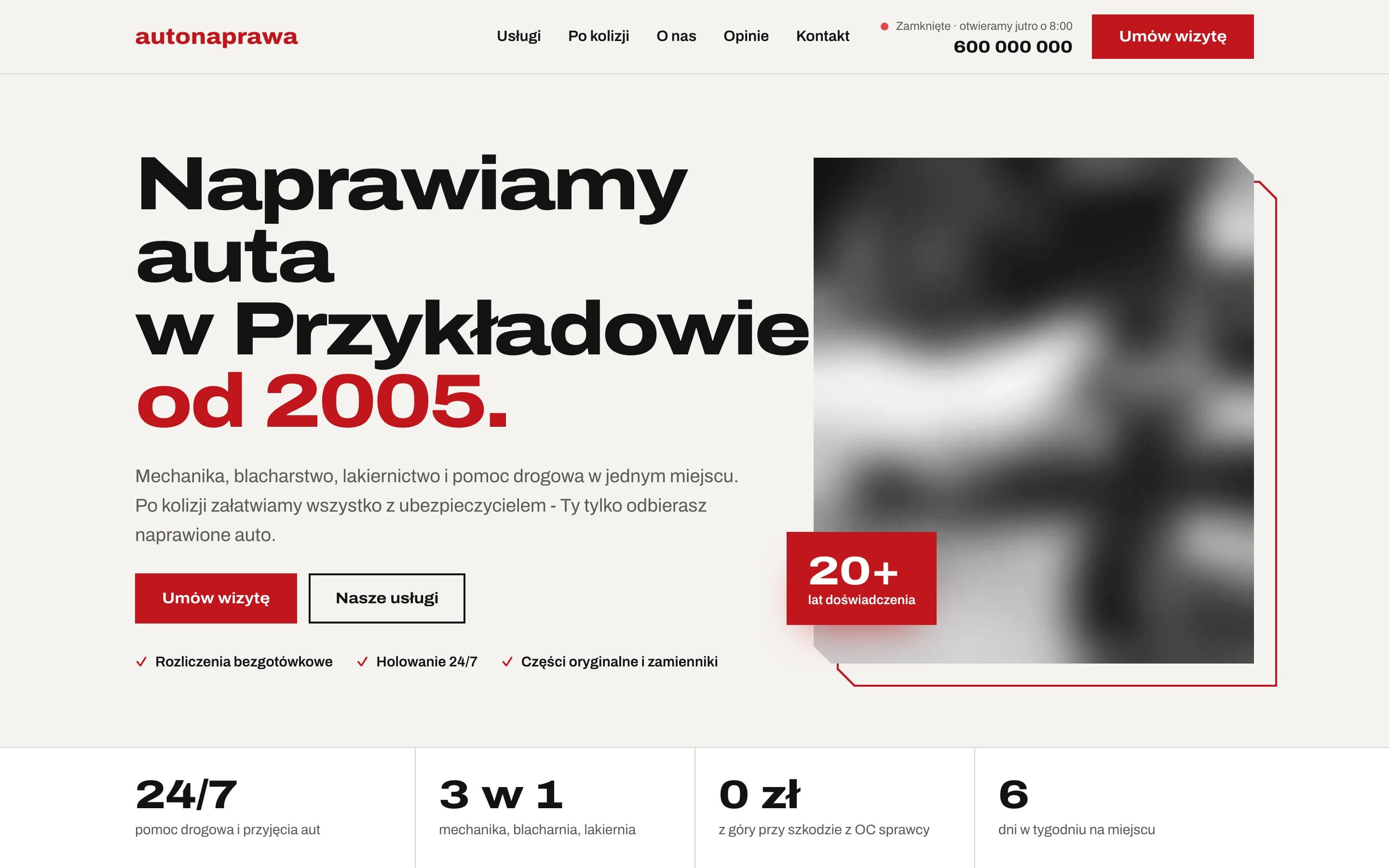
The background is a warm, paper-like tone instead of sterile white, which suits a family business with a long history. The brand colour is a deep red. On dark sections we use a lighter version of it to keep contrast in line with accessibility guidelines (WCAG). Everything is set in a single typeface, Archivo, with a variable character width: headings are wide and heavy, body text calm and easy to read.
Hero and numbers
The first screen opens with a large heading and the founding year in the brand colour. Next to it is a photo in a frame offset by a few pixels, like a print laid on paper, and a red badge with the years of experience. Below the hero is a strip of four numbers: "24/7" (roadside assistance), "3 in 1" (mechanics, panel beating, paint shop), "0 zł" (nothing upfront when the other driver is at fault) and "6 days a week". In a few seconds, customers see what sets this garage apart.
The "After a collision" section
This is the only dark section on the page, so it's impossible to miss. The heading says it plainly: "You call. We handle the rest." Below it, a timeline shows the steps: the call and tow truck, reporting the claim, the repair and cashless settlement with the insurer. The steps appear one by one when the section scrolls into view, so they read like instructions.
A service area map
Instead of yet another embedded Google map, we drew a schematic one: the garage in the middle, with the surrounding districts and nearby municipalities around it, to scale in kilometres. It's lightweight, sharp on any screen and shows at a glance that the garage is close by.
Features that make contact easier
- Visit booking with field validation and Polish phone numbers formatted as you type, e.g. "600 100 200".
- A live opening status in the header and in the mobile menu.
- A footer with the full company details: every phone number large and at the top, opening hours for each day of the week, and payment details with a button to copy the bank account number.
- Customer reviews with photos in a dedicated section, linking to the Google business profile.
SEO: 8 services, 8 chances in search results
- Separate service pages: mechanical repairs, oil and filter changes, brakes, suspension, panel beating and painting, collision repairs, 24h roadside assistance and windscreens. Each has its own title, description and FAQ.
- Structured data for the garage with the address and opening hours generated from a single source, so they never drift out of sync with what's on the page.
- FAQs marked up as structured data and breadcrumbs on every subpage.
- A lightweight static site that opens quickly on phones, which is where a driver who's just had a collision will be looking.
The result
A driver who has just had a collision lands on a page that tells them exactly what to do: call. Everyone else finds the service, a free slot and directions in seconds, and the garage gets a site that looks as solid as its work.
Want a similar project?
Tell us about your business and we'll suggest where to start.
More projects
Event Studio - A bilingual event agency website with 150+ attractions
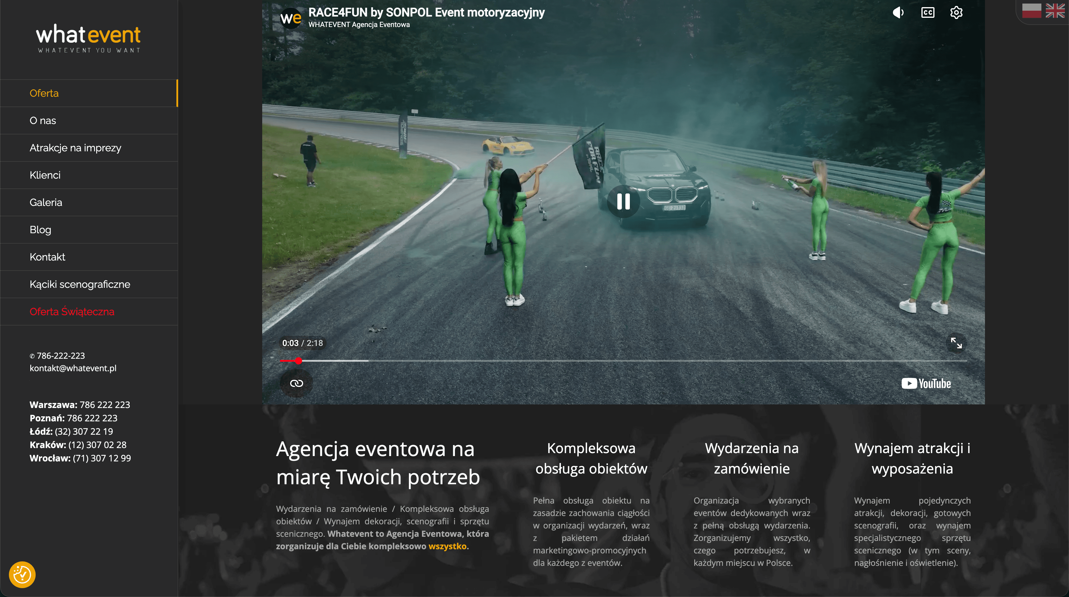
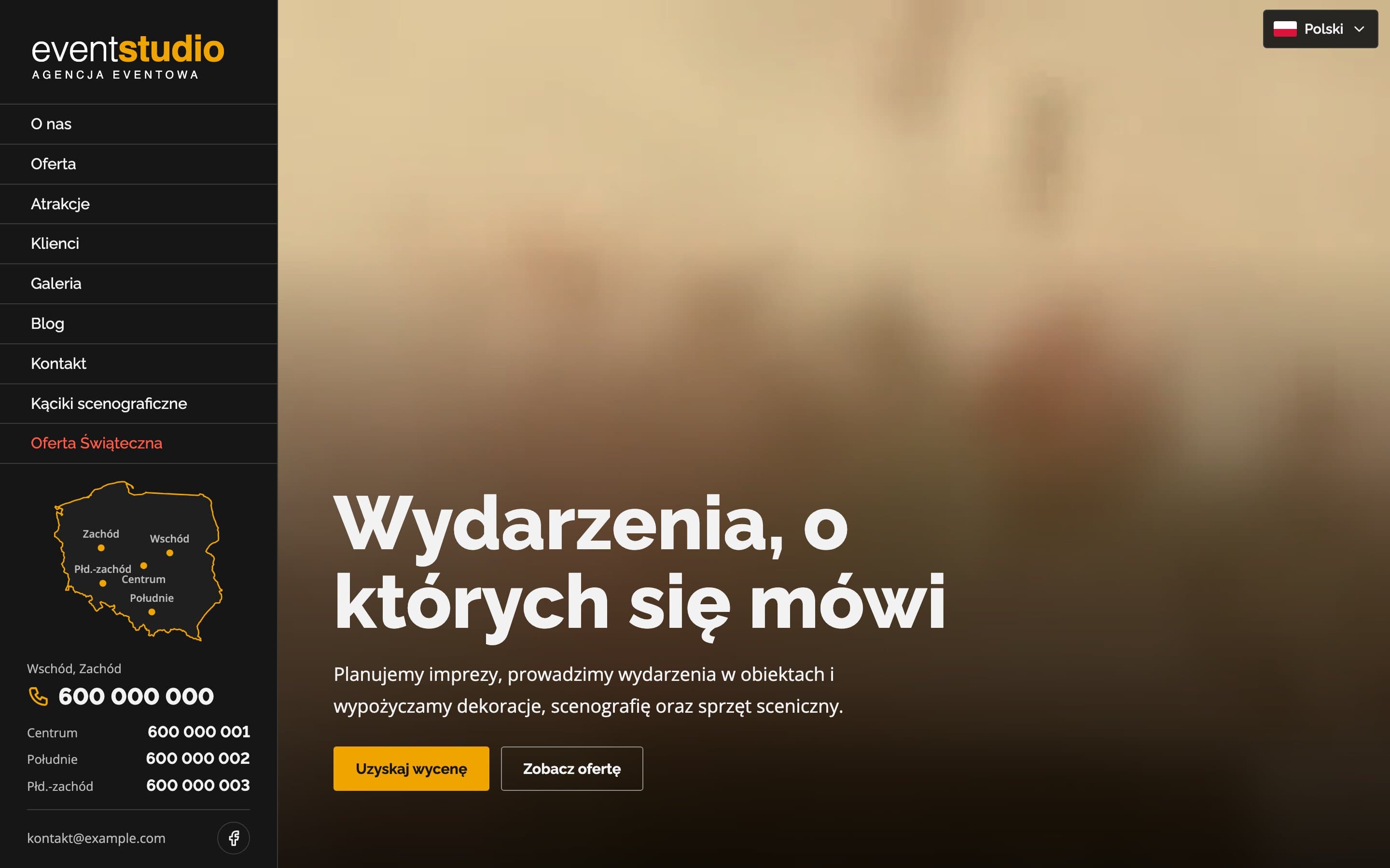
A bilingual event agency website with a video hero and 17 service pages. Visitors can search more than 150 attractions, and a map of Poland highlights the region each phone number covers.
Therapy & Growth Practice - A calm website for a therapist
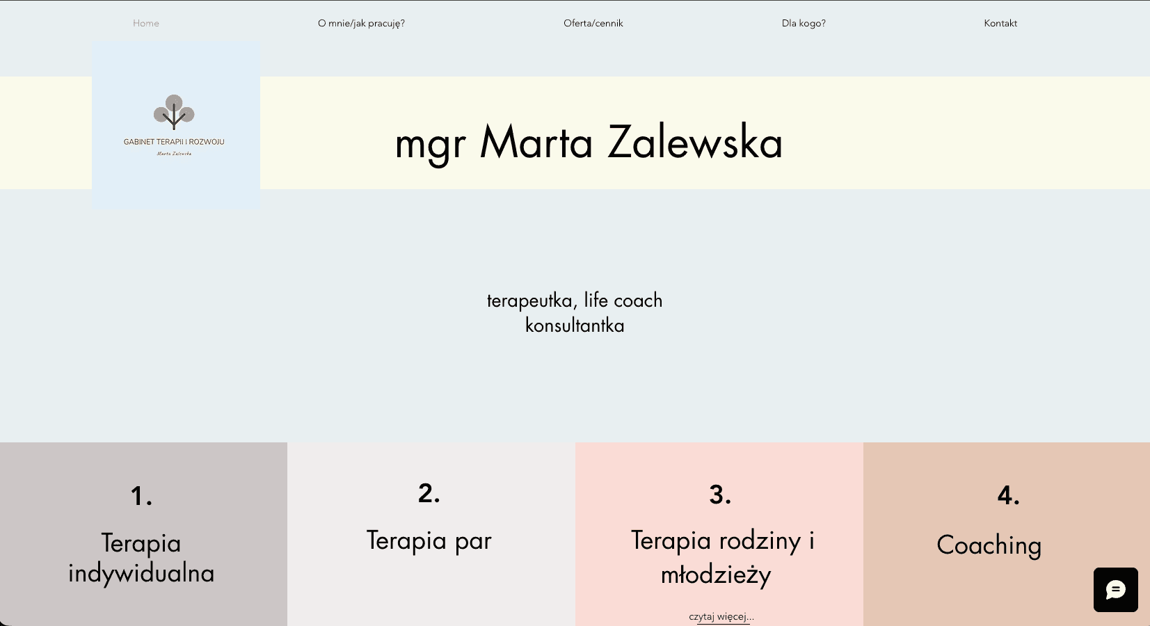
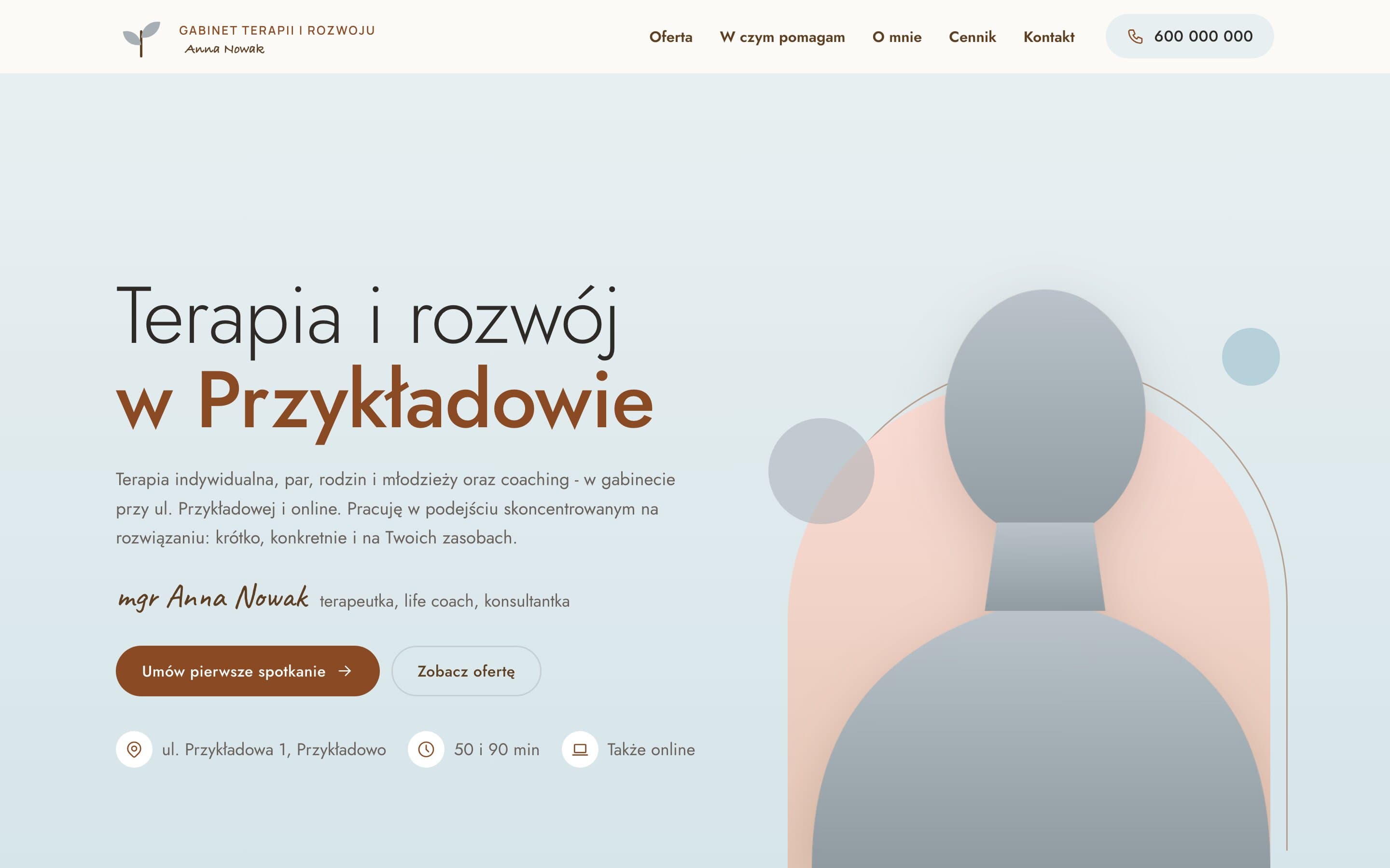
A therapy practice moved from Wix to a fast, warm website. A portrait on a pastel arch, separate pages for each form of therapy with price and session length, and a simple path to the first appointment.
Fotobudka Studio - An elegant website for a wedding photo booth rental
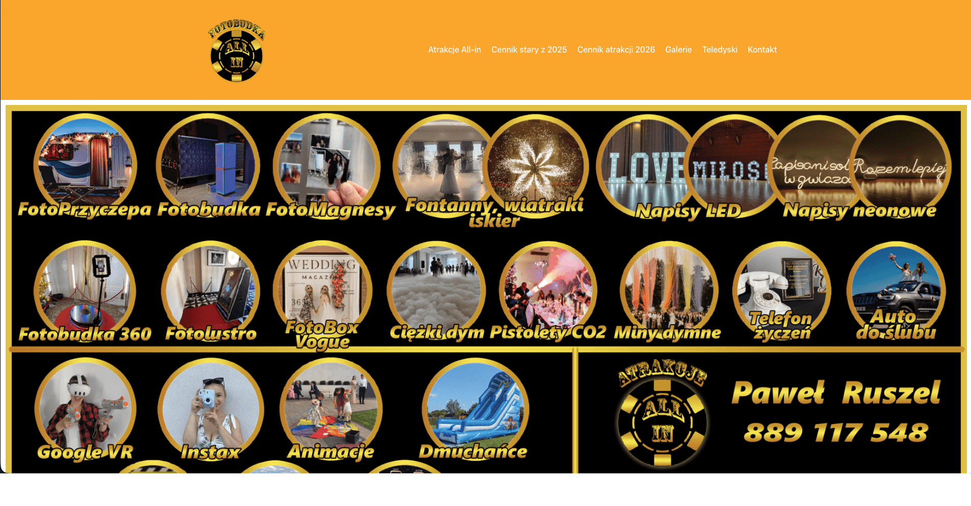
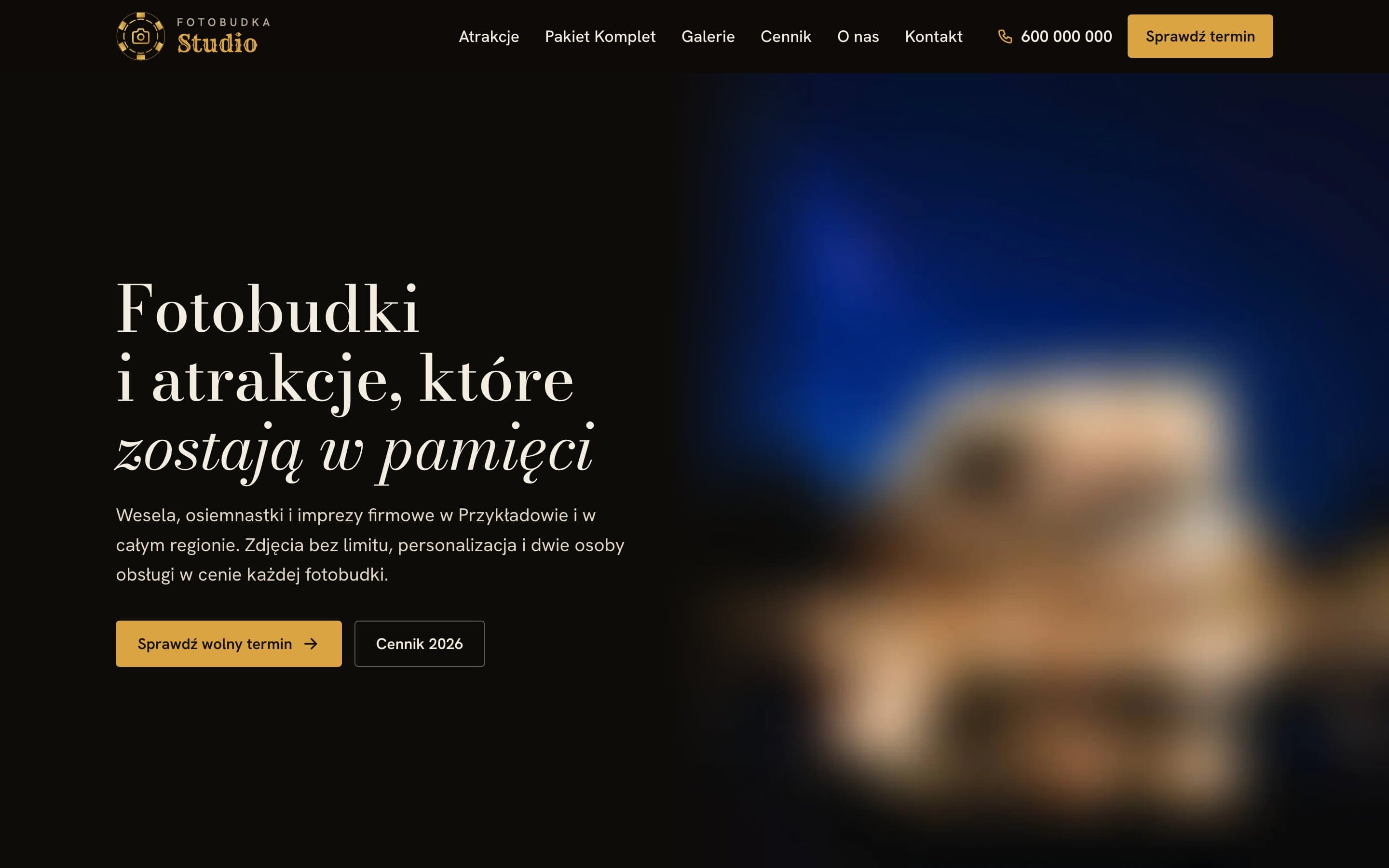
An elegant website for a photo booth rental: a catalogue of attractions with prices, a clearly presented package and a price list split into categories. Event galleries have filters and an easy-to-use photo viewer.