Survey Studio - A land surveyor's website with an interactive map
An outdated land surveyor's site turned into a modern one. The hero is a contour map drawn in code, clients can search the towns the studio covers, and every surveying service has its own page.
Visit website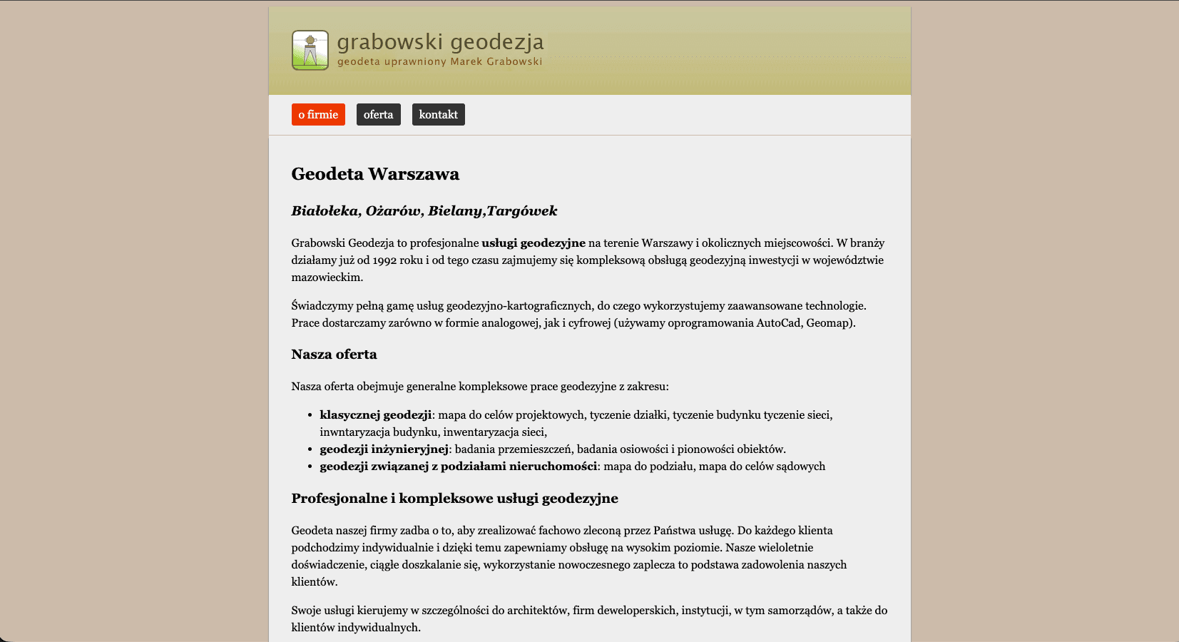
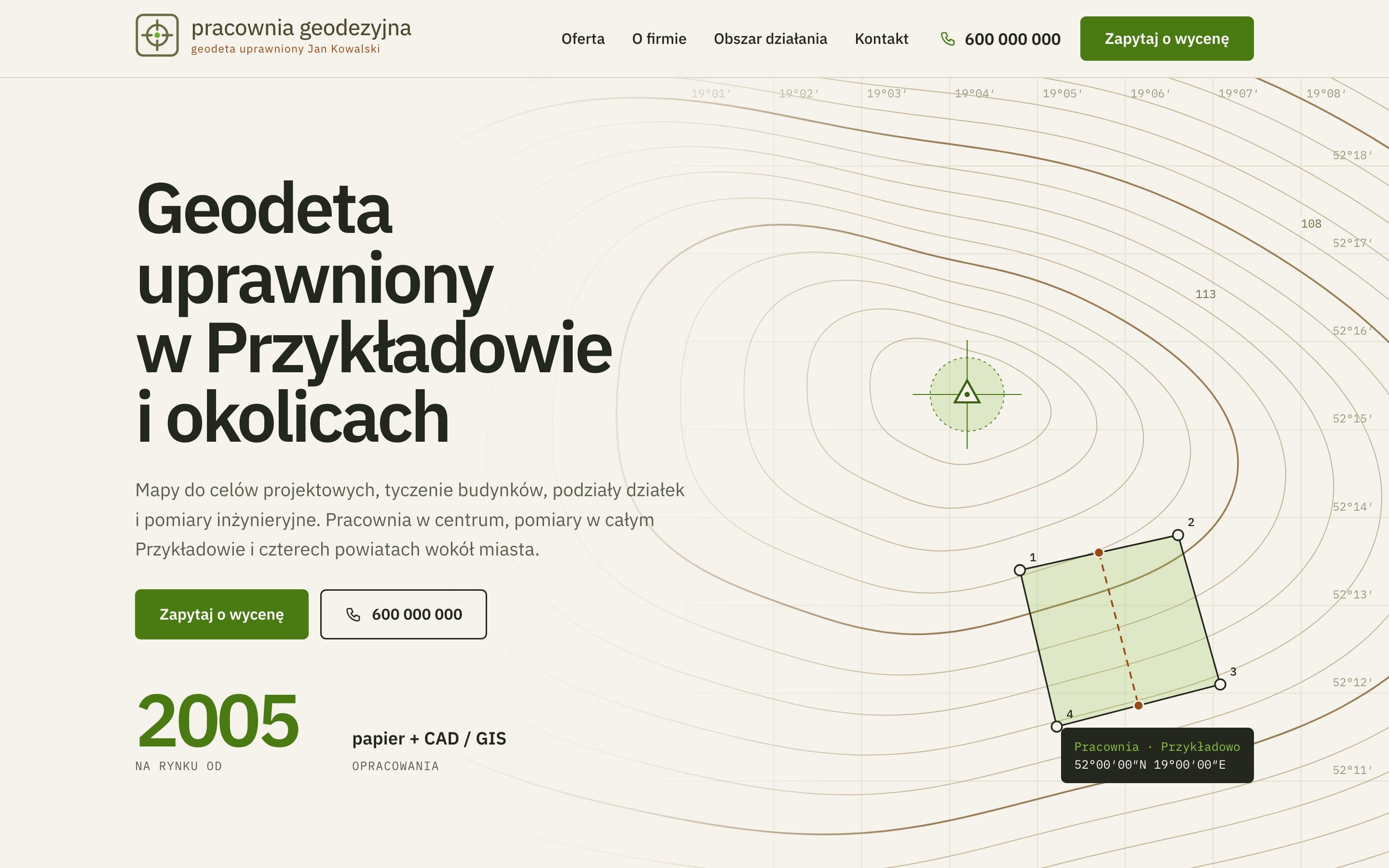
How we designed a surveyor's website that looks like a map from the first screen and instantly answers: "Do you cover my area?"
A surveyor's clients usually have two questions: does the studio cover my town, and how soon can I book? The old site answered neither: a GIF logo, long blocks of text and a list of towns with no structure. We designed a new land surveyor website with a visual identity based on a survey map, a service area search and service pages built for local Google searches.
The challenge
The studio's site looked over a decade old. On a phone you had to scroll through a wall of text to find the number, and checking whether the surveyor would come to your plot meant reading the whole list of towns. Services, from maps for design purposes to displacement monitoring, were described in one long text, so none of them could appear in search results on its own.
Design: a site that looks like a surveyor's work
A hero built from a contour map
Instead of a stock photo, the whole first section is a fragment of a map: contour lines, a coordinate grid labelled in degrees and minutes, a control point, and a plot with numbered boundary points and a dashed division line. The contours aren't an image. We generate them in code so that each line is slightly larger and offset, like the slope of a hill, and no two lines ever cross. On the left, the map fades out gently so the heading and buttons stay readable.
Palette and typography
The colours come from paper maps: a warm, paper-like beige for the background, olive and green as brand colours, and a rust accent for highlights. A deep green closes the page in the footer. Body text is set in IBM Plex Sans, while coordinates, point numbers and small labels use IBM Plex Mono. The technical, "measured" monospace instantly brings survey documentation to mind.
Logo and icons
The logo has a simple mark, a crosshair in a rounded square, with the name set as live text, so it stays sharp on any screen. All icons come from one consistent set (Tabler Icons) and are inlined as vectors, with no extra files to load.
Layout and rhythm
Each section on the homepage takes roughly one screen, and the menu scrolls smoothly to each of them. The key number, the year the studio was founded, is large and in the brand colour. The steps of working together appear one by one when the section scrolls into view, from the first call to finished documentation.
Features that shorten the path to an enquiry
- Service area search. Clients type in their town and immediately see whether it's covered. The search ignores Polish diacritics and letter case, so "lesna" finds "Gmina Leśna".
- Contact in one view: phone numbers, address, a directions map and a short enquiry form. The map loads only when the visitor scrolls to it, so it doesn't slow the page down.
- A "Call" button on phones that's always under your thumb, wherever you are on the page.
SEO: every service gets a shot at its own spot in Google
- Separate pages for each surveying service: maps for design purposes, building setting-out and as-built surveys, land division, engineering surveys and utility coordination. Each has its own title and description aimed at what clients actually search for, such as "map for design purposes" or "land division".
- FAQs on service pages, marked up as FAQ structured data so they can appear directly in search results.
- Structured data for the business, its services and breadcrumbs, so Google knows who provides which services and where.
- The list of covered districts and municipalities as plain text on the page, which strengthens visibility in local searches.
- A sitemap and lightweight static code, so the site loads quickly, including on phones.
The result
The site finally answers the questions clients arrive with: what do you do, do you cover my area, and how do I get in touch? And from the first screen it looks like a surveyor's work, not just another company business card.
Want a similar project?
Tell us about your business and we'll suggest where to start.
More projects
Event Studio - A bilingual event agency website with 150+ attractions
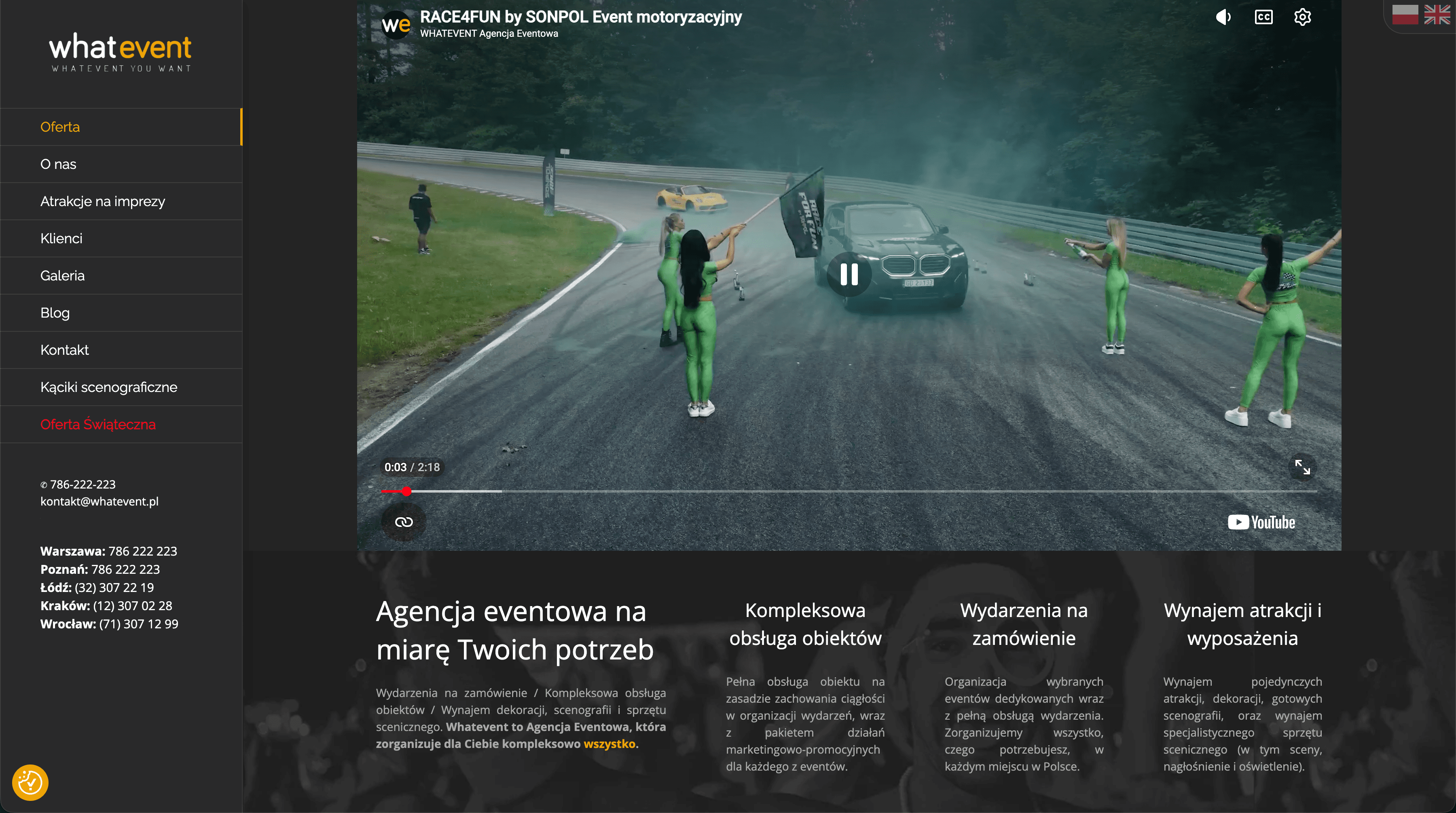
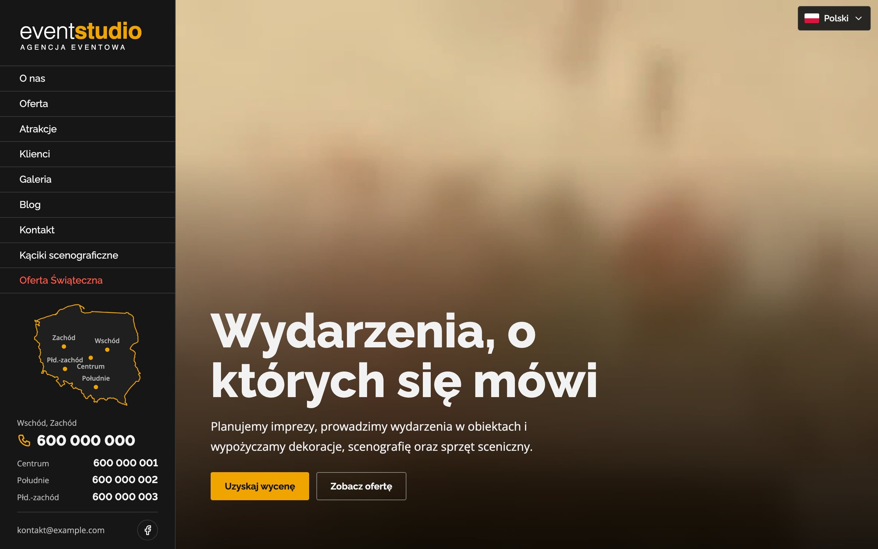
A bilingual event agency website with a video hero and 17 service pages. Visitors can search more than 150 attractions, and a map of Poland highlights the region each phone number covers.
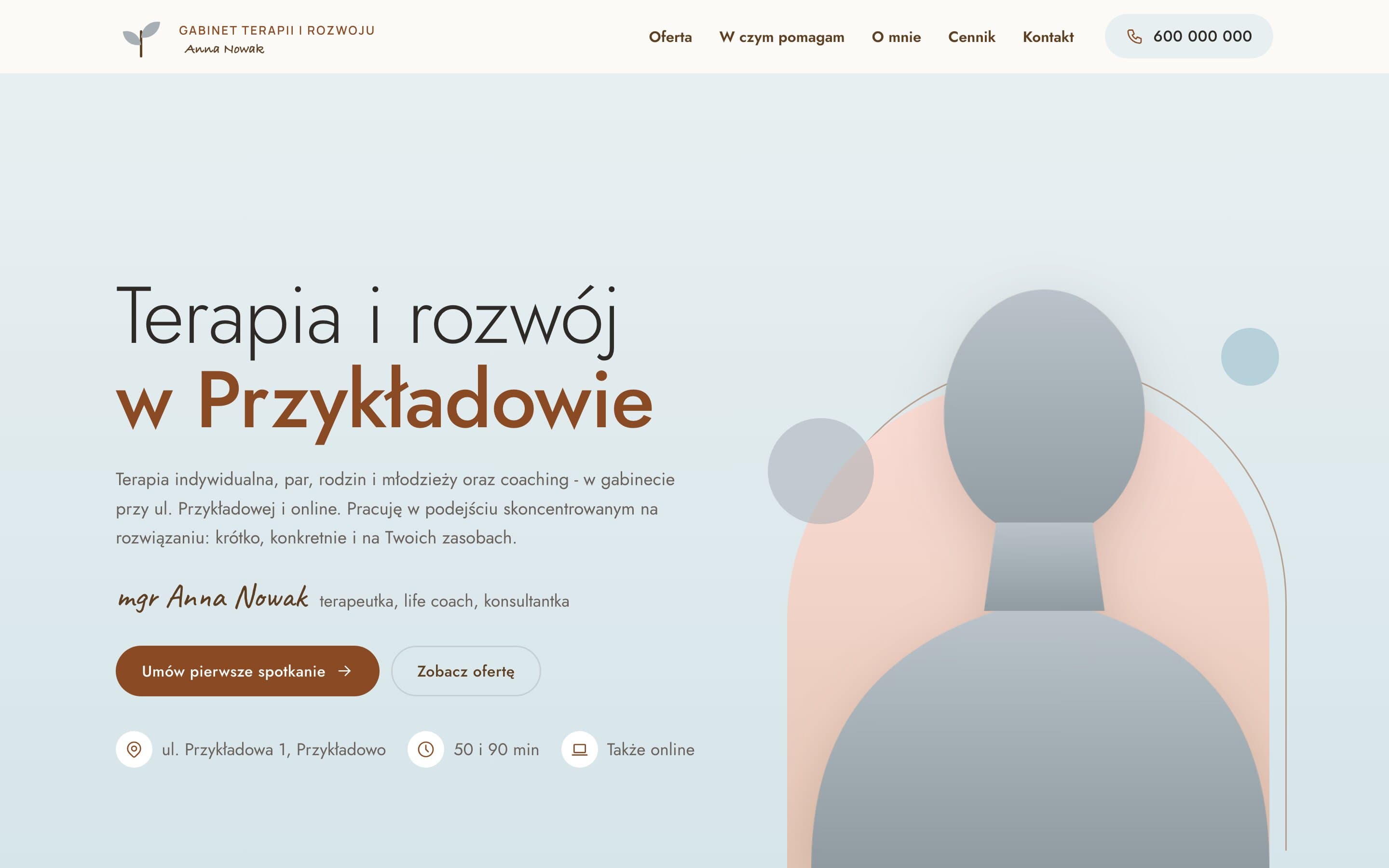
Therapy & Growth Practice - A calm website for a therapist
A therapy practice moved from Wix to a fast, warm website. A portrait on a pastel arch, separate pages for each form of therapy with price and session length, and a simple path to the first appointment.
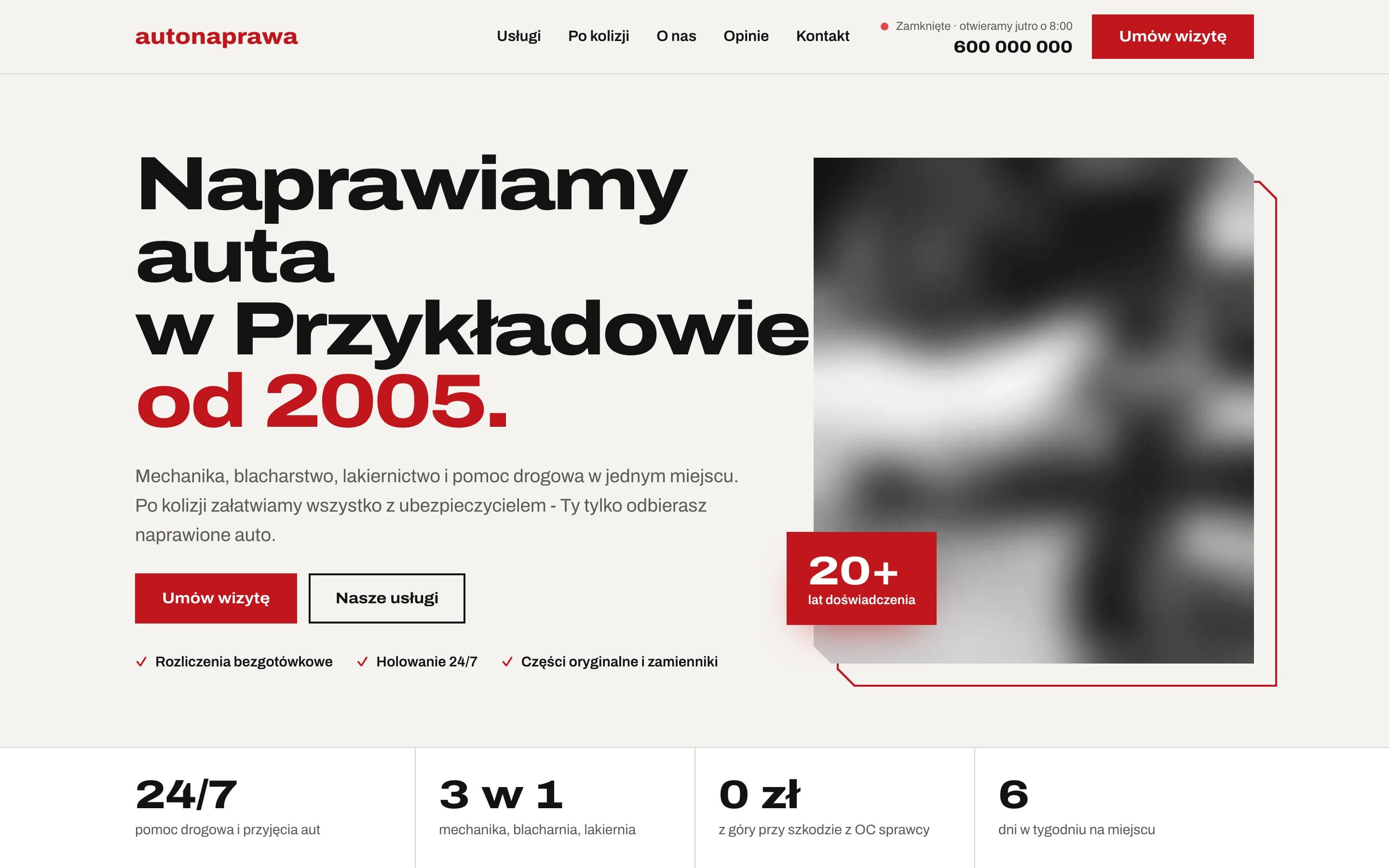
AutoNaprawa - A garage and body shop website built around collision repairs
A garage website rebuilt from scratch, replacing an old WordPress site. Drivers who just had a collision get a dedicated step-by-step path, visits are booked online, and the header shows a live opening status. Plus 8 service pages built for local SEO.