Candy Flowers - A website for a sweet bouquet studio
A website built from scratch for a sweet bouquet studio in Mielec, Poland. Powder pink with gold, a filterable gallery with a preview, occasions, a three-step ordering process and an FAQ, all ready for local search.
Visit website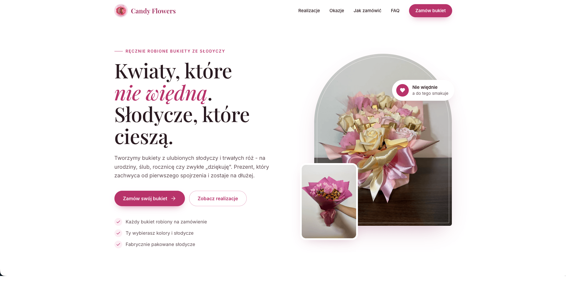
How we designed a website from scratch that sells candy bouquets the way they look: sweet, but classy
A candy bouquet is a gift you have to see to want, and many people don't know such a product exists. Candy Flowers needed a website that explains in seconds what a sweet bouquet is, shows finished bouquets and leads straight to an order. We designed it from scratch: a visual identity in powder pink with gold, a filterable gallery, an occasions section, a simple three-step process and content built for local searches in Mielec and the surrounding area.
The challenge
Candy Flowers makes handmade bouquets from favourite sweets and preserved roses. It's a product that's easy to mistake for a florist or an ordinary sweet hamper, so the site had to say clearly from the first screen what it is, and show the result right away. On top of that, people usually look for a gift for a specific occasion, often at the last minute and on a phone. The site had to be fast, easy to read on a small screen and lead straight to contact.
Design: sweet, but classy
Palette
The colours come straight from the bouquets: a very light powder pink for section backgrounds, soft rose tones, and a deep raspberry for buttons and highlights. The accent is a muted gold, a nod to gold chocolate wrappers and ribbons. We checked the main pink for contrast: on white it reaches 5.6:1, which meets accessibility requirements (WCAG AA). The text isn't black but a warm, very dark plum-brown that sits better alongside the pinks.
Typography
Headings are set in Playfair Display, an elegant high-contrast serif, and the key words are in italics, as in "Flowers that never wilt". Body text uses Inter, a modern and highly readable sans serif. Both typefaces are hosted with the site, so there are no requests to third-party servers, and the most important font files are preloaded.
Shapes and depth
There are no sharp corners on the site: corner radii come in three sizes (small, medium and large), and buttons are fully rounded like sweets. Shadows aren't grey. They have a slight pink tint, so cards and photos look as if they're floating above pink paper rather than a dull sheet.
Hero
The main bouquet photo stands in an arch with a rounded top, like a florist's shop window. Next to it is a second photo, behind them a soft blurred patch of pink, and on top a badge reading "Never wilts, and tastes great too". The heading plays with words: "Flowers that never wilt. Sweets that bring joy." Below the buttons are three short reassurances: each bouquet is made to order, you choose the colours and sweets, and all sweets are factory-sealed.
Section rhythm
Sections alternate between white and powder-pink backgrounds, so the page keeps a clear rhythm even when scrolling quickly. Content fades in gently on scroll, and for people who have turned off animations in their system settings, everything is visible straight away. Contact closes the page with a rich raspberry block with subtle concentric rings in the background, the only colour that strong on the site.
Sections that turn curiosity into an order
- Why a sweet bouquet? Four benefits on cards with icons: it never wilts, it brings double the joy, it's tailored to the person and it's handmade.
- A gallery of finished bouquets with filters: for her, for him, bottle wraps and colourful. Clicking opens a preview with the photo next to the bouquet's description, and cards animate in briefly when the filter changes.
- Occasions: birthdays, name days, weddings, anniversaries, Mother's and Grandmother's Day, thank-yous, jubilees and "just because". Everyone finds their reason.
- Three steps to a gift: write or call, we'll work out the details, collect the finished gift. Each step has a number in a circle with a pink outline.
- Customer reviews and 8 frequently asked questions in an expandable list: about how long a bouquet lasts, price, ordering time, collection and allergies.
- Contact with phone, email and social media profiles.
Details that make a difference
- A sticky header with a blurred background behind it. It gets a soft shadow as you scroll, and menu items have an underline that stretches out on hover.
- A mobile menu that also works with the keyboard.
- Images in lightweight WebP format, loaded only when needed. The hero image loads with top priority.
- Privacy-friendly analytics that track clicks on the order buttons and which bouquets in the gallery visitors actually look at. The owner learns what people like, without tracking-cookie banners.
SEO: sweet bouquets that people in Mielec can find
- A page title and description aimed at local searches, such as "candy bouquets Mielec" and "an alternative to flowers".
- Florist structured data with the address, coordinates and a list of nearby towns the bouquets go to.
- Location meta tags and a polished social sharing preview (image, title and description).
- Content that answers customers' questions: the occasions section and FAQ naturally include the phrases people type into Google when looking for a gift.
- A lightweight site with no unnecessary scripts, which helps it load quickly on phones.
The result
Candy Flowers has a website that explains in seconds what a candy bouquet is, shows over a dozen finished bouquets and leads straight to an order. And it looks just like the bouquets themselves: sweet, but classy.
Want a similar project?
Tell us about your business and we'll suggest where to start.
More projects
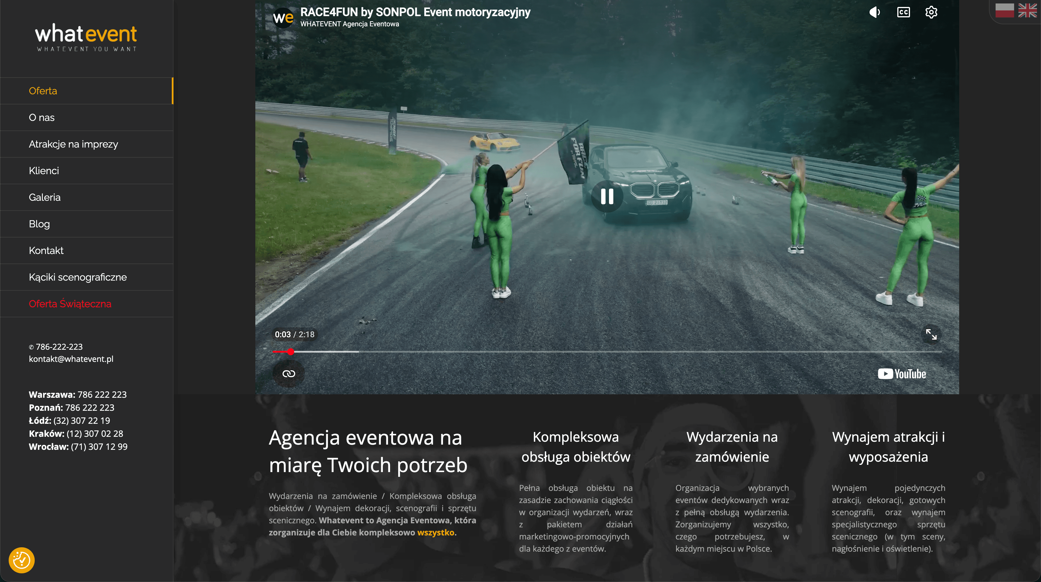
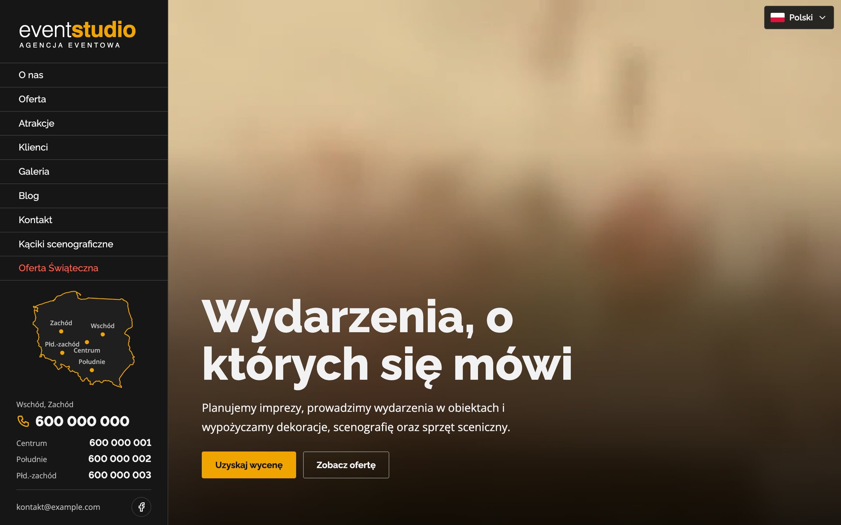
Event Studio - A bilingual event agency website with 150+ attractions
A bilingual event agency website with a video hero and 17 service pages. Visitors can search more than 150 attractions, and a map of Poland highlights the region each phone number covers.
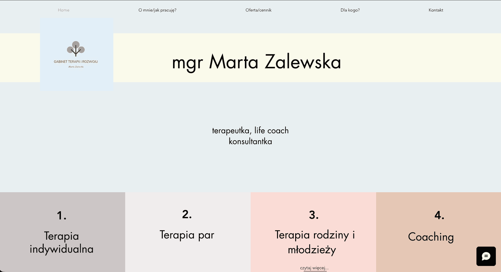
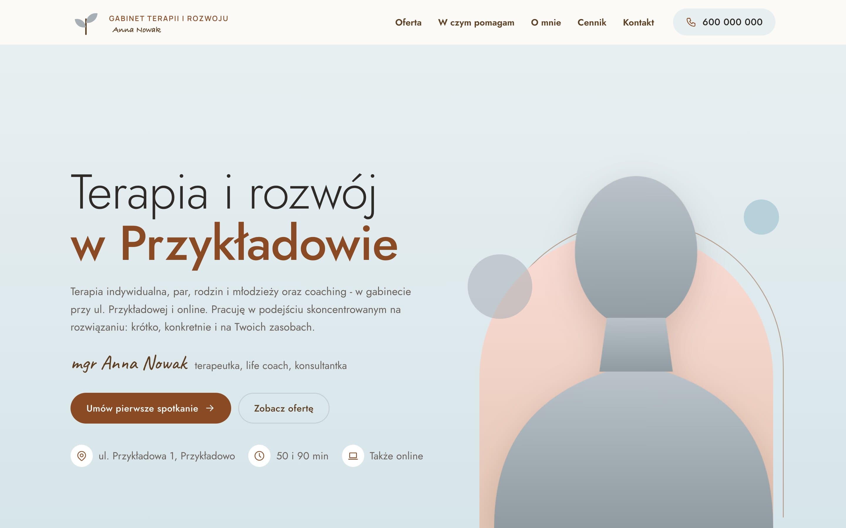
Therapy & Growth Practice - A calm website for a therapist
A therapy practice moved from Wix to a fast, warm website. A portrait on a pastel arch, separate pages for each form of therapy with price and session length, and a simple path to the first appointment.
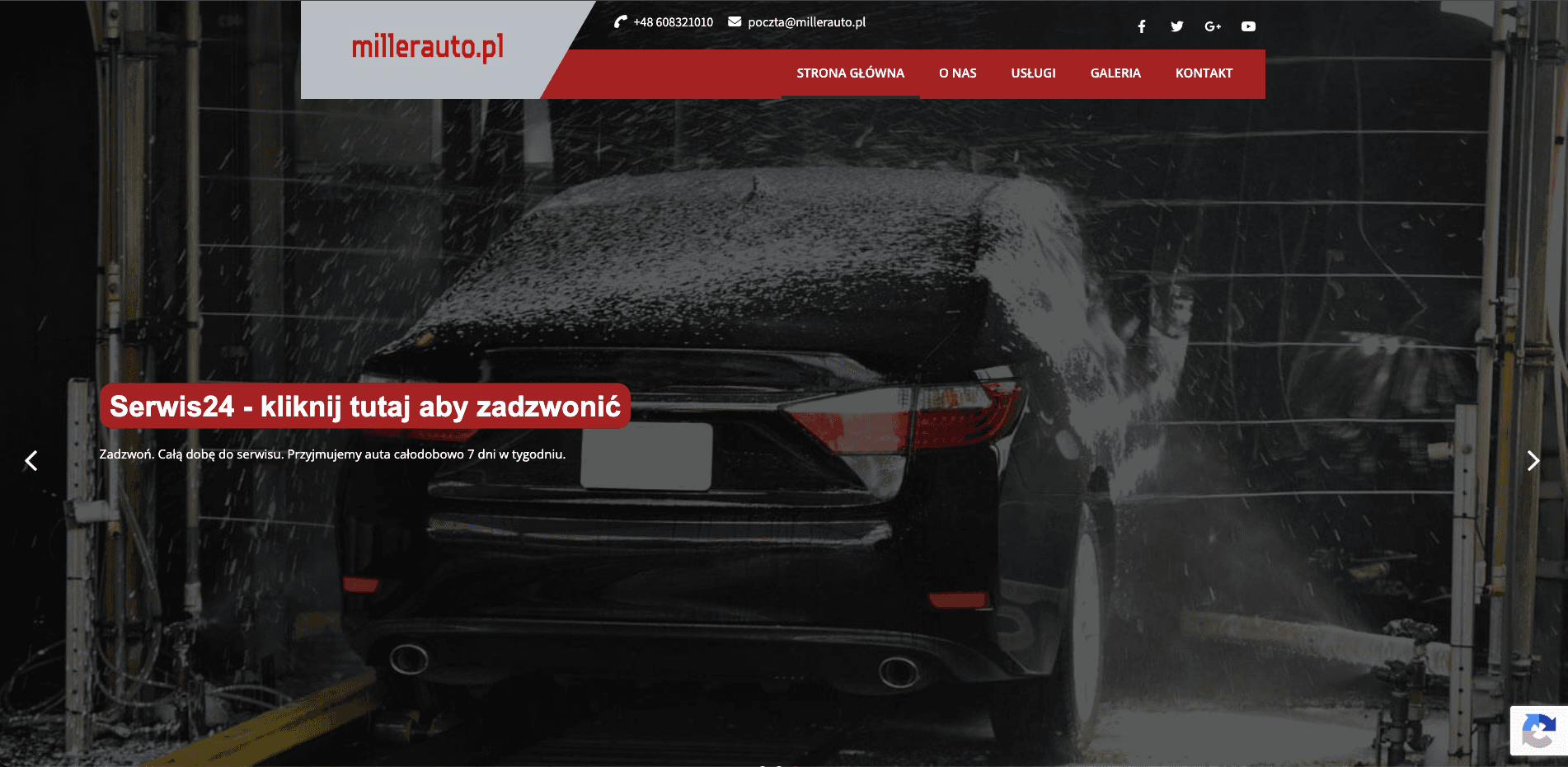
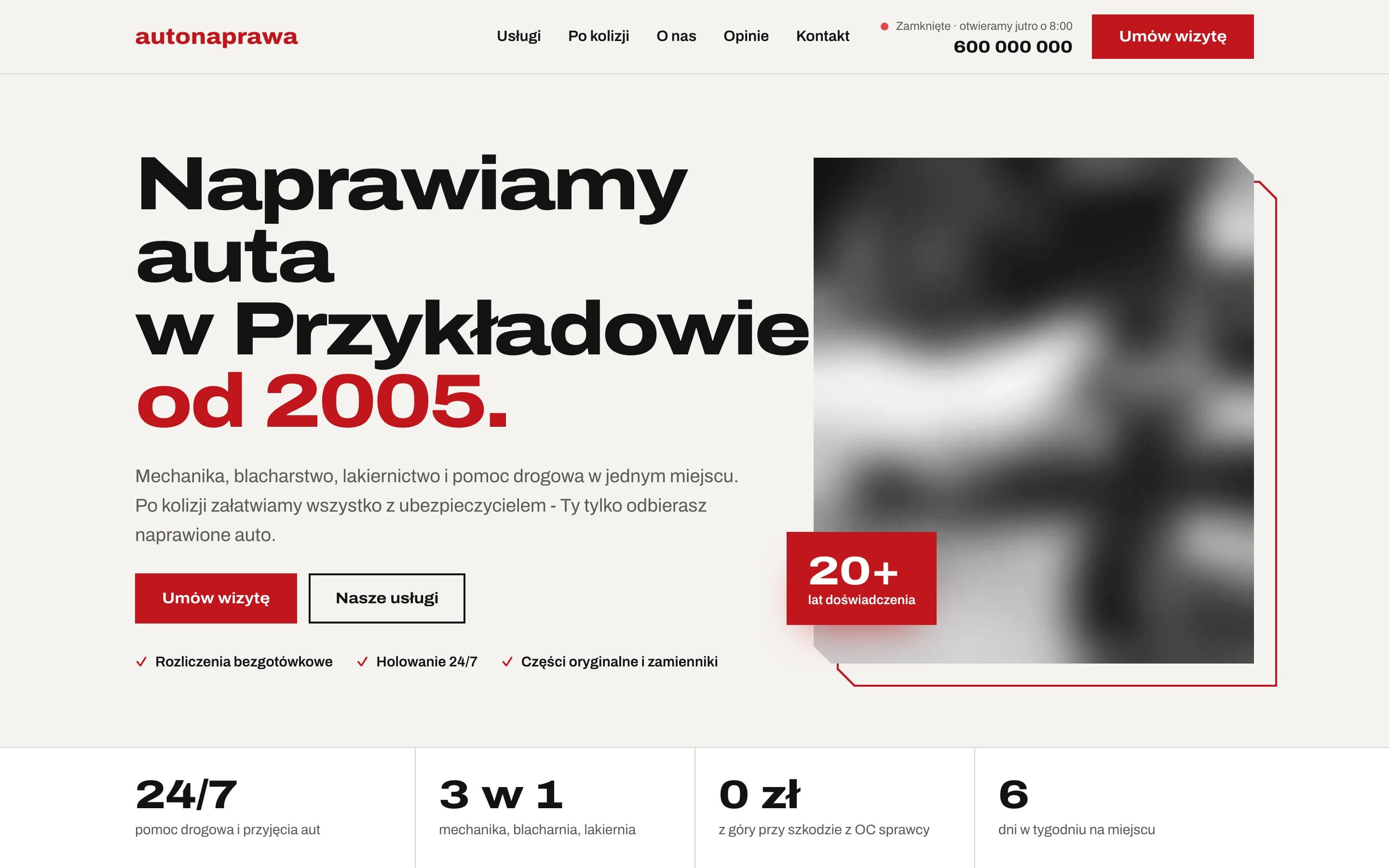
AutoNaprawa - A garage and body shop website built around collision repairs
A garage website rebuilt from scratch, replacing an old WordPress site. Drivers who just had a collision get a dedicated step-by-step path, visits are booked online, and the header shows a live opening status. Plus 8 service pages built for local SEO.