Real Estate Agency - website with a property search
A new website for a local real estate agency: listings with filters and photo galleries, separate category pages, a mortgage section with FAQs and a contact form that fills in the listing number by itself. Plus a refreshed identity and an animated sales process.
Visit website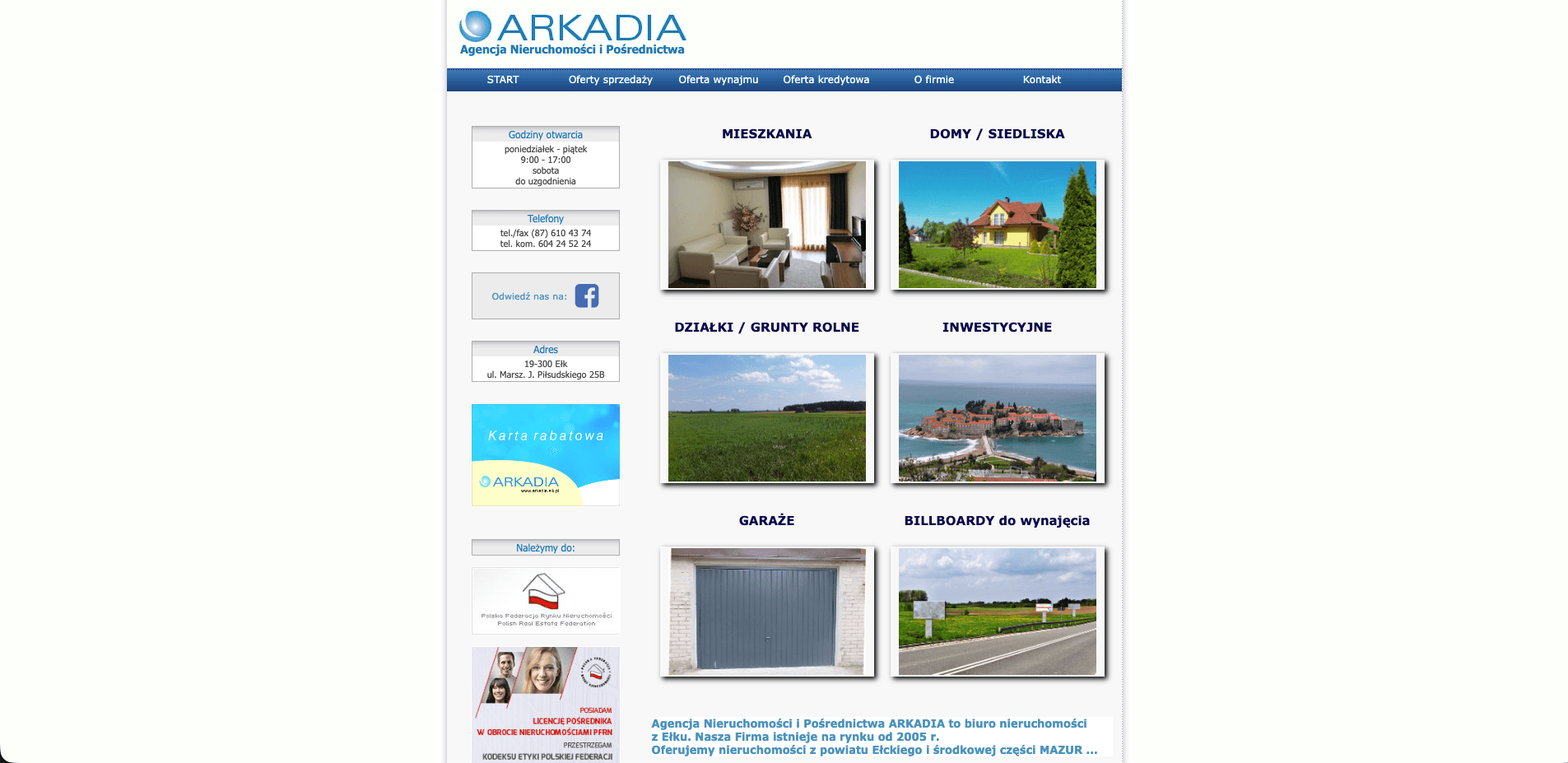
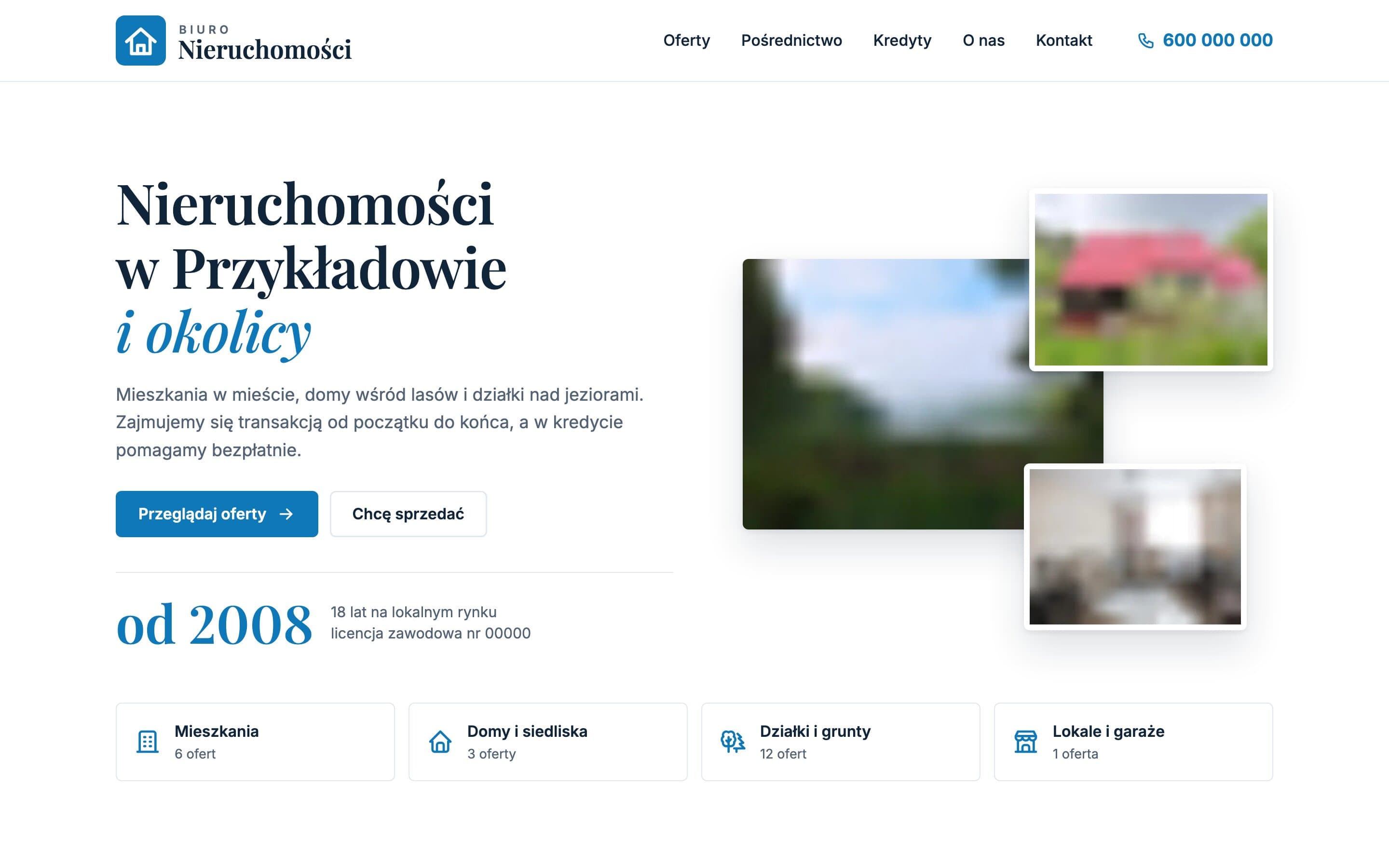
How we turned a list of ads into a real estate agency website where listings can actually be browsed
A buyer looks through dozens of listings and gives up quickly when they can't filter them or see the photos in a large size. The agency's old site was a long list of text, with listings scattered across separate pages and no shared navigation. We designed a real estate agency website with a property search, clear listing cards, a gallery on every listing and pages built for local searches such as "flats for sale", "building plots" or "mortgage advice".
The challenge
The agency sells a bit of everything: studio flats in the centre, houses by the forest, rural homesteads, lakeside plots and farmland. On the old site, though, every listing looked the same: a block of text with a small photo. There was no way to narrow the list down to three-room flats or sort listings by price, and sold properties were mixed in with available ones. On top of that, mortgage advice, the discount card and billboard rental were buried in the menu, even though they are important extra services for the agency.
Visual design: calm, trustworthy and local
Colours and typography
The palette starts from the blue in the agency's logo. The brand colour only appears on buttons, icons, prices and highlights, while the rest of the page is built from white, a very light blue on every other section and a navy footer. Headings are set in the elegant serif Playfair Display, with key words picked out in brand-coloured italics, e.g. "Properties in Przykładowo and the area". Body text uses Inter, which stays readable in small listing details and tables.
Logo
The logo is simple and flat: a blue square with rounded corners and a white house outline, next to a small "BIURO" label and a large "Nieruchomości" set in the same serif as the headings. The mark on its own works as the favicon and the home-screen icon on phones.
Hero with a photo collage
The first screen pairs a short headline with a collage of three listing photos: a lakeside landscape, a house and a flat interior. The smaller photos sit in white frames overlapping the larger one, and all of them keep their natural 4:3 proportions, so nothing is cropped awkwardly. Below the headline sits the founding year in large type, and below everything four category tiles with the number of current listings.
The sales process animation
The "From the first call to handing over the keys" section shows the five steps of a transaction. Next to them a line-drawn house appears piece by piece: the ground, the walls, the roof with a chimney, the windows and door, and finally a lit window and smoke from the chimney. Each step adds one part, and the animation plays once, when the section comes into view.
Features that help buyers and sellers
- A listing search with filters that don't reload the page: category tabs, number of rooms, sorting by price and area, and a "Show sold" switch. The chosen category stays in the address, so the results can be shared.
- Listing cards with badges for "Price reduced", "New price", "On hold" and "Sold", the price per square metre and the key details in one line.
- A listing page with a proper gallery: arrows, swiping, thumbnails, a photo counter and a full-screen view that works with the keyboard. Next to it: the price, a details table, the agent's card and similar properties.
- "Ask about this listing" with a pre-filled form. The button jumps to the contact section and puts the listing number into the message. "Book a valuation" switches the topic to selling.
- Contact on one screen: phone numbers for property sales and mortgages, a map that only loads when you scroll to it, a "Navigate" button and a short form with a phone field in Polish format.
- Pages for the extra services: mortgage advice, a discount card with local partners and billboard rental with a price list.
SEO: listings and services visible in local results
- Separate category pages: flats, houses and homesteads, plots and land, and commercial units and garages, each with its own title and description.
- Every listing has its own address and real estate listing structured data with price and availability, plus breadcrumbs.
- Real estate agent structured data with the address, opening hours and service area, and an FAQ section marked up for Google on the mortgage page.
- Listing cards are in the HTML, not loaded by a script, so search engines see every listing. The sitemap updates with every release.
- Fast loading: static code, WebP images in several sizes and short, readable addresses.
The result
Listings can finally be browsed the way a buyer does it: narrow down, compare and see the photos in a large size. Every listing ends with a simple route to contact that carries the listing number, and sellers can see straight away how the agency handles a transaction. Mortgage advice, the discount card and billboards each have their own place, so they no longer get lost in the menu.
Want a similar project?
Tell us about your business and we'll suggest where to start.
More projects
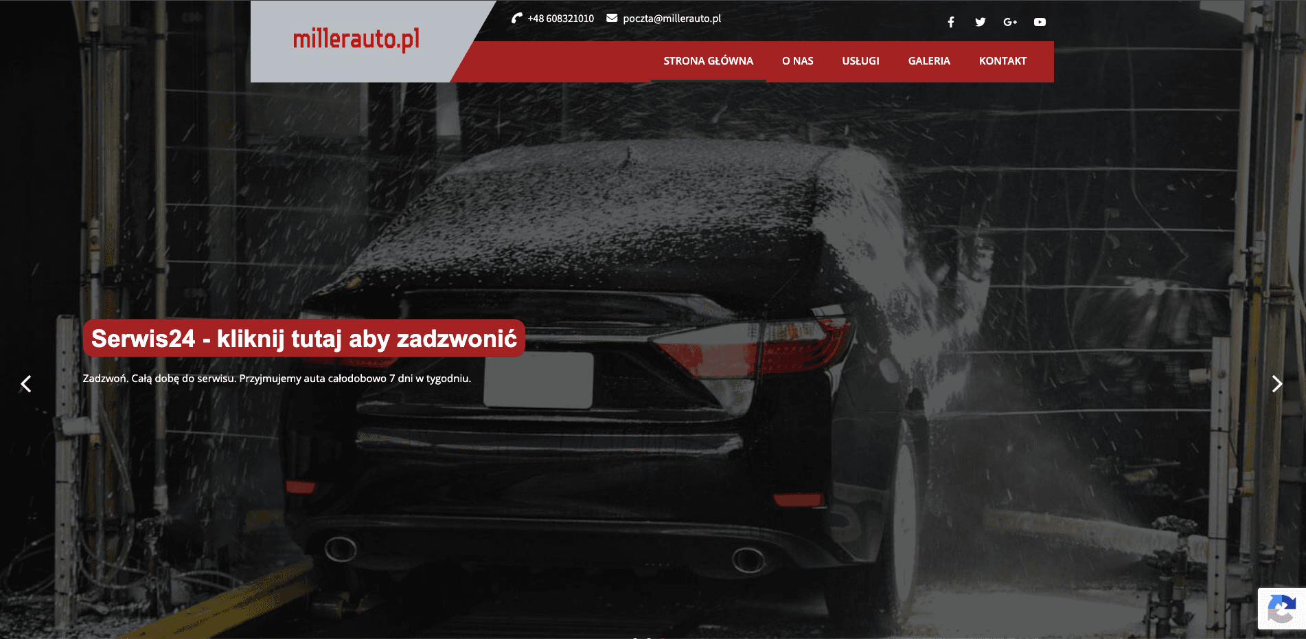
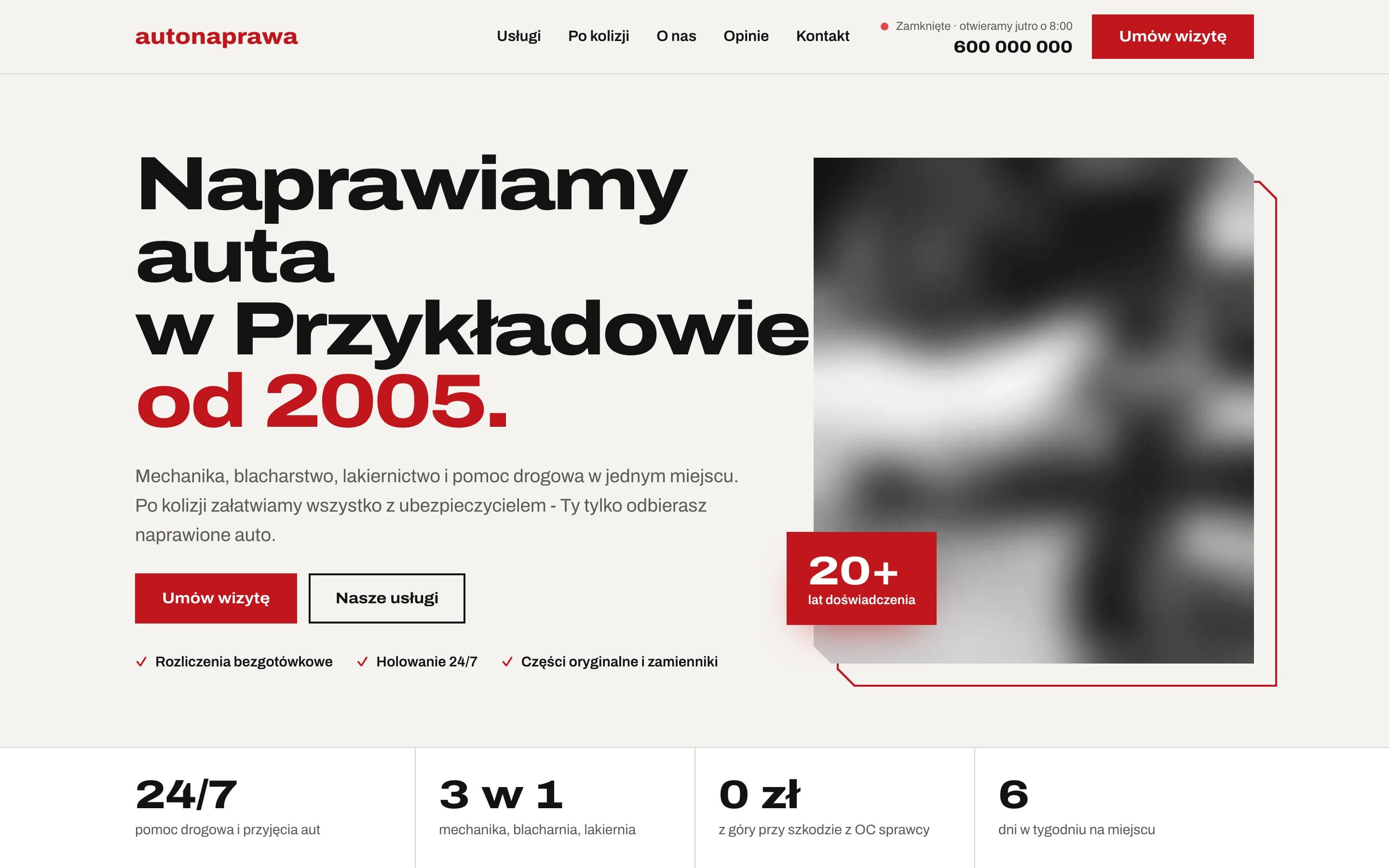
AutoNaprawa - A garage and body shop website built around collision repairs
A garage website rebuilt from scratch, replacing an old WordPress site. Drivers who just had a collision get a dedicated step-by-step path, visits are booked online, and the header shows a live opening status. Plus 8 service pages built for local SEO.
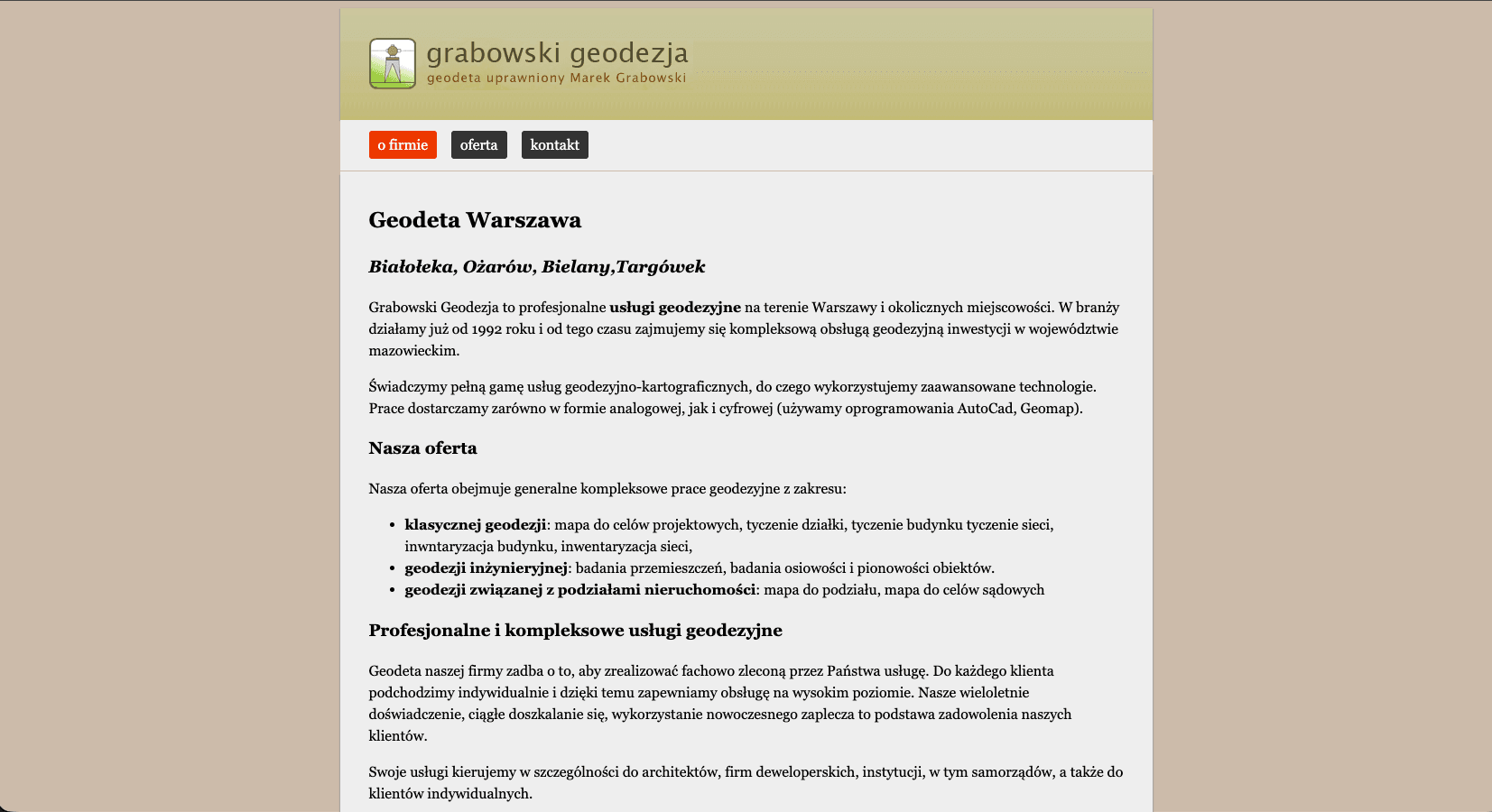
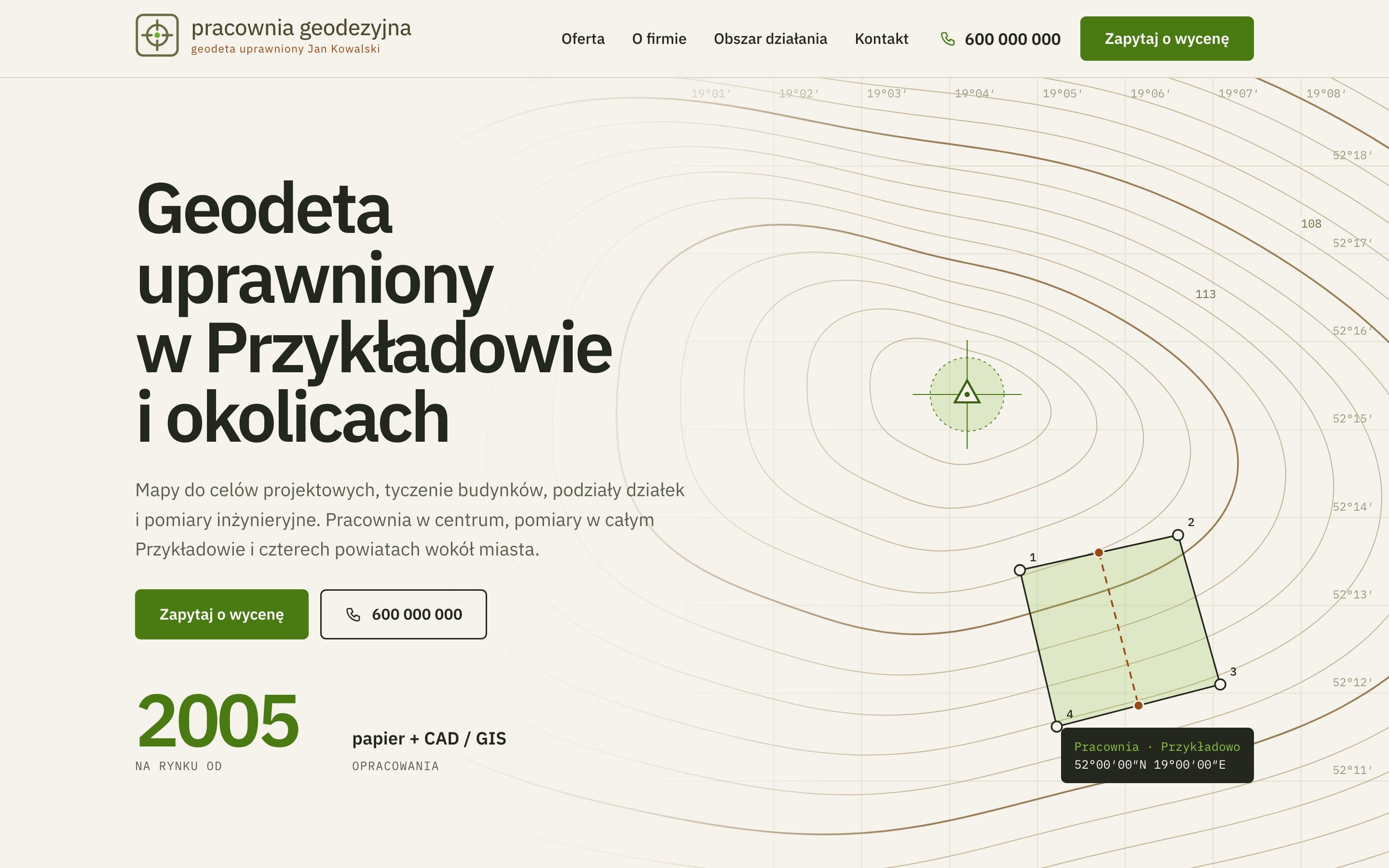
Survey Studio - A land surveyor's website with an interactive map
An outdated land surveyor's site turned into a modern one. The hero is a contour map drawn in code, clients can search the towns the studio covers, and every surveying service has its own page.
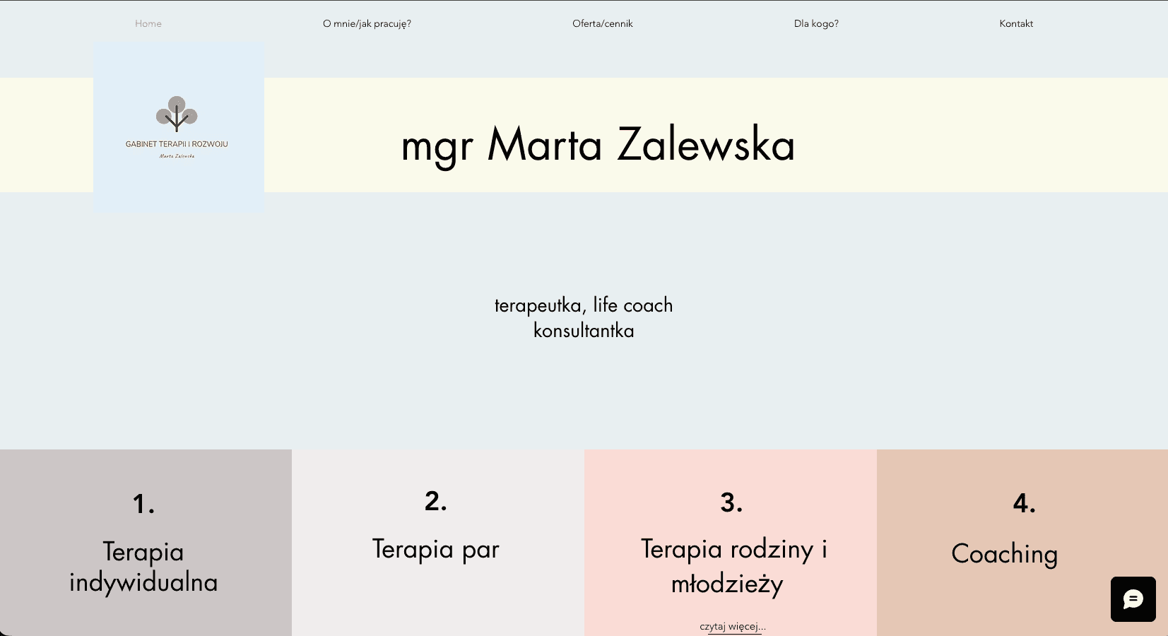
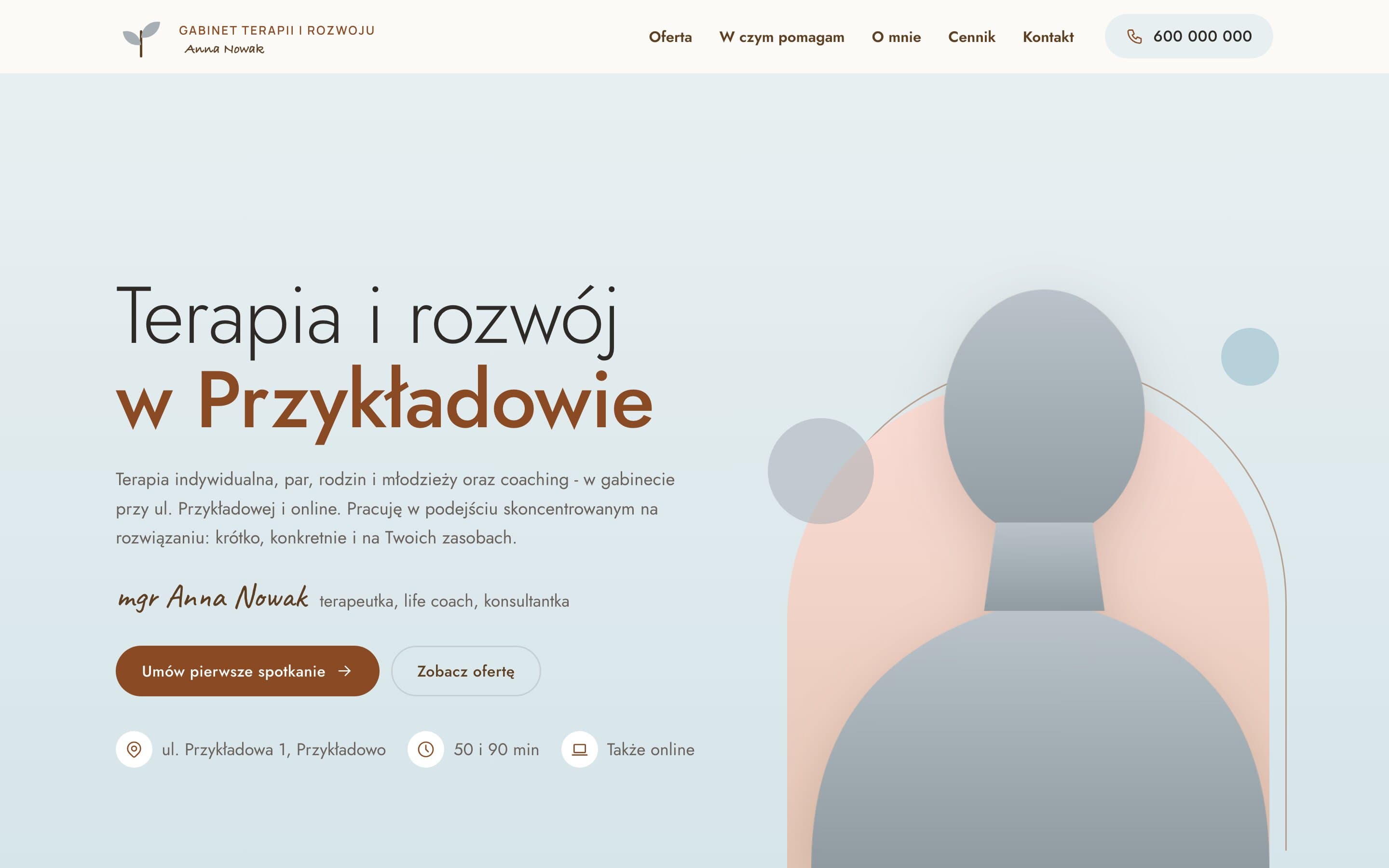
Therapy & Growth Practice - A calm website for a therapist
A therapy practice moved from Wix to a fast, warm website. A portrait on a pastel arch, separate pages for each form of therapy with price and session length, and a simple path to the first appointment.